


I’m going to start off by saying the “good” version of anything is subjective. You might think The Cheesecake Factory makes the best cheesecake in the world, and I might think it tastes like plastic.
The same follows with “good” UX writing — unless it’s validated by user testing, simply saying something is “good” UX writing is purely subjective.
That said, there are UX writing guidelines that are pretty much proven to lead to UX writing users love.
There are 6 key UX writing best practices:
When achieved together, UX content thrives 🦄
I’m going to dive into each one of these in detail. As you’re reading through, I encourage you to notice these best practices as you go about daily life. Actively look for them. The more you can spot UX writing out in the wild, the more these lessons will sink in.
1. Clear
Clear UX content is jargon-free and offers context. It’s:
- Easy to understand
- Easy to scan
- Obvious
- Unambiguous
- Leave no doubt
- Can’t be misinterpreted
As an example, take this tool tip from Figma:
Figma optimizes for all levels of investment. Just want the quick takeaway? You get all the meat in the headline. Want to know a little more? The body adds more context around the value you get from this new feature.
It’s very clear because it’s easy to scan, and you can’t really misinterpret the message.
Well done, Figma 👏
2. Concise
Concise UX content is economical and front-loaded. It:
- Cuts filler words and phrases
- Uses progressive disclosure
- Avoids passive voice
- Avoids hyperbole
- Uses the shortest form of a word
Take this welcome email from Medium:

In a simple headline and call-to-action, Medium communicates a message that packs a punch. It’s written in active voice and very action-oriented.
That said, the message could be even more concise by removing “your” in the call-to-action.
3. Useful
Useful UX content points to the next action. It:
- Offers context to help people make decisions
- Writes a path for every direction
- Understands people in all their possible states
For example, take this sign-up screen from Facebook:

Facebook does two things here to make the experience useful:
- By saying Facebook is and will always be free, they offer context to help people make decisions
- By giving people an option to learn why Facebook needs their birthday, they offer important context and write a path for every direction
The screen leaves someone with few unanswered questions and a path to answer the ones they do have.
4. Helpful
Helpful UX content makes experiences hassle-free. It:
- Answers any and all questions that could come up
- Surfaces the right information at the right time
- Uncovers what context is *actually* helpful
- Translates the value of facts for the user
Take this sign-up question from Twitter:
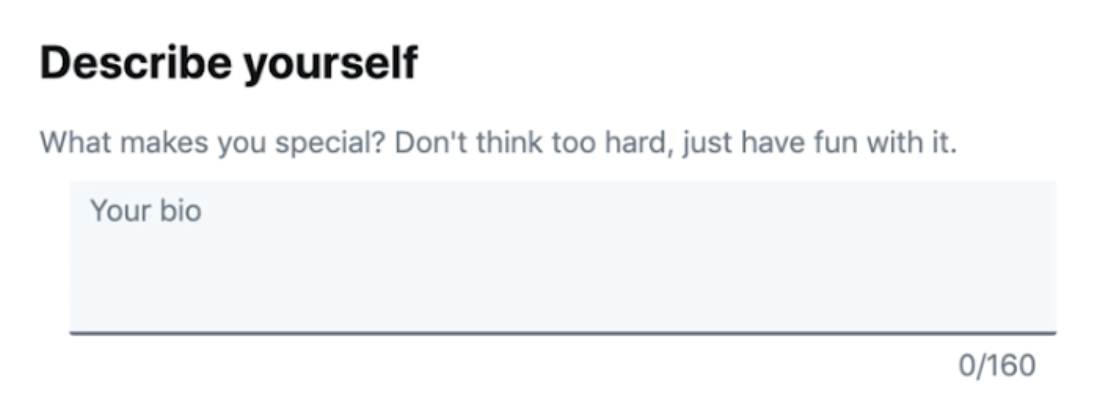
Describing yourself can be daunting. Twitter adds an air of helpfulness by encouraging you to “just have fun with it” and think about “what makes you special.” Those leading questions help someone write their bio more easily by adding helpful context and the right time.
5. Usable
Usable UX content is the baseline for solid engagement. It:
- Doesn’t make someone think about how a product works
- Offers no distractions throughout an experience
- Makes completing tasks is easy and intuitive
Take this prompt from Tumblr:
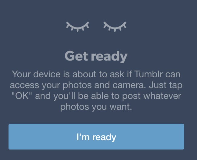
By explaining what’s going to happen next, Tumblr creates a very usable experience, because the user won’t get caught off guard when their device asks them for photo and camera access. This makes posting a photo easy and intuitive while minimizing frustrating distractions.
6. Accessible
Accessible UX content ensures everyone’s included. It:
- Doesn’t make assumptions about how someone is navigating a product
- Uses text instead of images with words on them
- Puts information and instruction before the action
- Doesn’t rely on visuals to convey relevant information
- Uses a descriptive calls-to-action
- Uses alt text to images, icons, and illustrations
Take this call-to-action link, for example:

When someone is using a screen reader, a link that simply says “read more” can be confusing. What are they reading more of? Using a more descriptive link, such as “Read more about [topic]” gives those using screen readers instant information about what they’re clicking on.
On top of those 6 best practices, there are three concepts core to “good” UX writing:
Happy UX writing 🖖

