


Mark Twain once said, “Writing is easy. All you have to do is cross out the wrong words.”
If you couple Mark’s advice with the fact that people read about 20% of the words on a web page, it’s clear being concise is imperative to UX content that sings.
It’s not that people don’t read — people read what’s valuable and relevant to them.
If your microcopy is too wordy or long, the connection becomes slow, awkward, and ineffective.
The best way to avoid that? Be concise.
Concise UX content:
- Gets rid of extra words
- Deletes redundancies
- Makes sure each word serves a heavy-lifting purpose
- Created designs understood in a glance
- Can take more time to write
Concise UX content doesn’t always mean shorter sentences — it’s more so about distilling a message into the most efficient package.

There are 6 key strategies to make your UX context more concise:
- Cutting filler words and phrases
- Using progressive disclosure
- Avoid passive voice
- Avoid hyperbole
- Use the shortest form of a word
- Front-loading
1. Cut filler words and phrases
Concise UX content only uses heavy-lifting words that each serve a purpose.
Unfortunately, there are many words and phrases in our language that offer little to no value. These are filler words and phrases that you can almost always delete from your UX content.
There are 10 key words and phrases to look out for:
- Looks like
- In order to
- That
- Please note
- We recommend
- You must
- There is
- Due to the fact that
- Apparently
- As mentioned previously
1. “Looks like”
The problem with “looks like” is either something is, or it isn’t. Be clear and decisive. Saying it “looks like something went wrong” is confusing and passive.
For example:
Not concise: Looks like something went wrong.
Concise: Something went wrong.
2. “In order to”
“In order to” is the longer cousin of “to.” You can truncate that bad boy.
For example:
Not concise: In order to change your address, contact customer service.
Concise: To change your address, contact customer service.
Even more concise: Contact customer service.
3. “That”
Nine times out of ten, a sentence continues to make sense without “that.” You can delete it.
For example:
Not concise: Changing your address will erase the one that you currently have on file.
Concise: Changing your address erases your current one.
Even more concise: This erases your current address.
4. “Please note”
Not only is “please note” very formal, but it’s also prefacing something someone is automatically doing. Feel free to skip it.
For example:
Not concise: Please note, you have to wait 30 days to update your address again.
Concise: Wait 30 days to update your address again.
5. “It’s recommended” or “we recommend”
It’s already implied that you’re recommending something if you’re saying it. Therefore, I don’t recommend saying you “recommend” something 🙃
For example:
Not concise: We recommend you change your password every 30 days to protect your account.
Concise: To protect your account, change your password every 30 days.
Even more concise: Change your password every 30 days.
6. “You must”
Requirements can be implied by leading with a directive verb.
For example:
Not concise: You must change your password.
Concise: Change your password.
7. “There is”
Most times, “there is” prefaces the real point. Instead of delaying, say the point outright.
For example:
Not concise: There is a requirement that you must change your password every 30 days.
Concise: You’re required to change your password every 30 days.
8. “Due to the fact that”
“Due to the fact that” is another prefacing phrase. Get straight to the point instead.
For example:
Not concise: Due to the fact you recently changed your address, you must wait 30 days to make a revision.
Concise: Wait 30 days to make another change to your address.
9. “Apparently”
If you’re saying something, it’s apparent. Saying “apparently” doesn’t offer emphasis, it makes a sentence less concise.
For example:
Not concise: Apparently you can’t sign in right now.
Concise: The server is down, so you can’t sign in.
10. “As mentioned previously”
Trust people to remember facts. Or, instead of saying “as mentioned previously,” link two thoughts together.
For example:
Not concise: As mentioned previously, your password will expire in 30 days.
Concise: Reminder: Your password expires in 30 days.
2. Use progressive disclosure
Great, concise UX content is like an onion — you peel back the layers to slowly get to the core.
(Just in case it’s not clear yet, I’m going to be talking about onions a lot 🧅)
Just like you wouldn’t swallow a whole bite of an onion at once, concise UX content slowly paces the important information you need to know at any given time.
This is called progressive disclosure, or disclosing information in a sequence of logical events, not all at once.
Using progressive disclosure will help you write one sentence and convey one task at a time, leading to a more concise experience.
For example, take this flow from Duolingo:
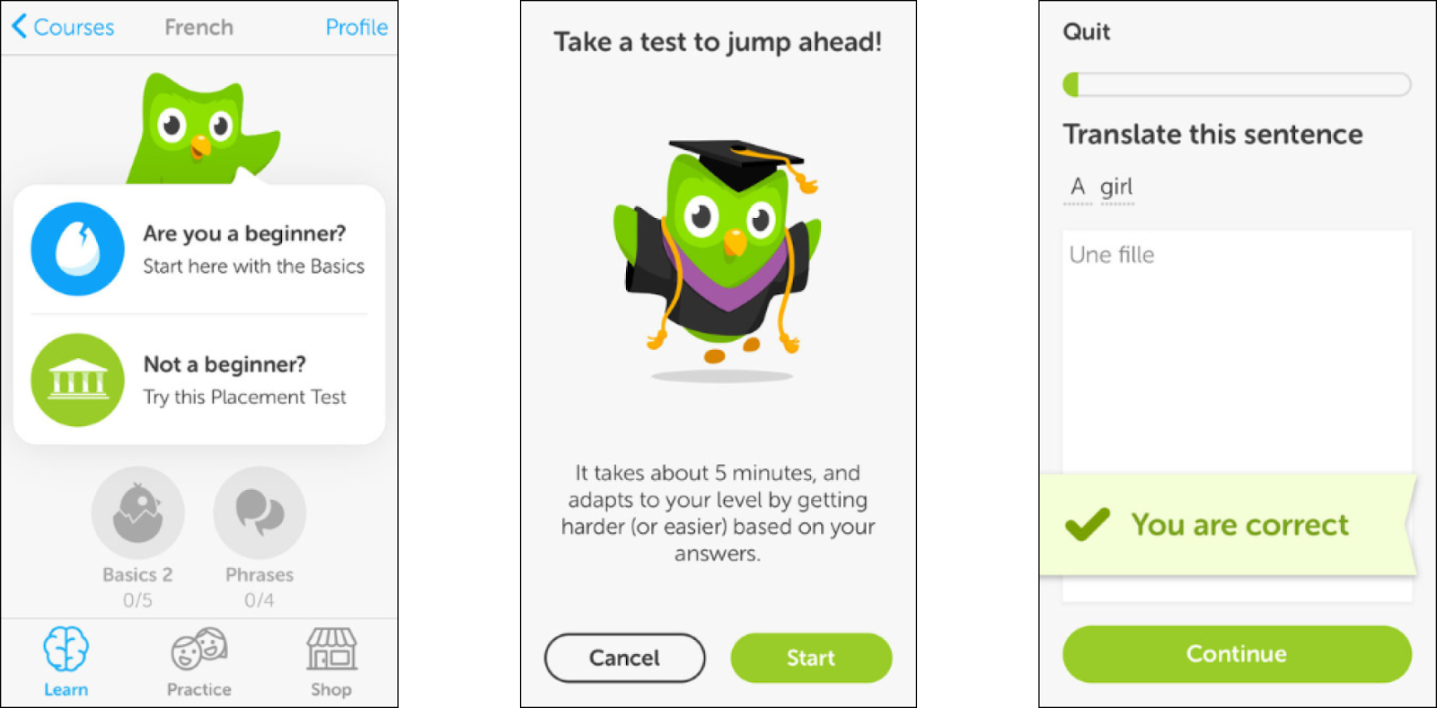
Instead of taking everyone on the same journey, the Duolingo owl starts by asking the user if they’re a beginner or not. That way, depending on which answer the user picks, Duolingo will only show the user relevant content based on their skill level.
Also, instead of jumping straight into the test, Duolingo paces out the information, so it’s timely and relevant.
We’ll dive deeper into progressive disclosure in Lesson 5.4, and this is a nice, quick intro.
3. Avoid passive voice
Passive voice is when the subject is acted on by the verb.
For example:
- Twitch is loved by gamers
- The account was opened by a new user
- The password was incorrectly entered by someone trying to log in
If you were to write these sentences in active voice, they’d read:
- Gamers love Twitch
- A new user opened an account
- Someone trying to log in entered the incorrect password
As you can see, passive voice makes sentences unnecessarily confusing and long.
Whenever possible, use active voice to make your sentences faster and easier to read (or skim.)
4. Avoid hyperbole
Hyperbole is an exaggeration for effect.
For example, not:
- Customers say our product is a million times better than the competition
- We've completely changed the game
- You'll be very happy if you subscribe
But instead:
- Customers rate our product 48% higher than the competition
- Our new product adds a brand-new spin on things
- I'll do my best to make sure you're a happy subscriber
Essentially, don’t write a sentence that sounds like it ends in an exclamation mark.
To do so, avoid excessive intensifiers like:
- Very
- So
- Completely
- Entirely
- Essentially
- Totally
Instead, let your idea, product, or value speak for itself.
5. Use the shortest form of a word
Some words have a shorter, more concise cousin.
For example:
- Utilize → use
- Conceptualization → concept
- Maximum → max
- Laboratory → lab
The shorter the words, the more likely it is you’d use them in every day, plain language.
6. Front-loading
People read in an F-shaped pattern, meaning they read the first line, second line, and scan the rest, only digesting the first or second word of each line.

The solution? Front-loading.
Front-loading puts the most important concepts first. That way, people get the key message upfront and can scan the lower-priority information as they go along.
For example, take the home screen of the plant care app, Greg:

The most important task for someone to do in Greg is to water their plants. Greg puts that front and center, so it’s incredibly clear what the priority of information is.
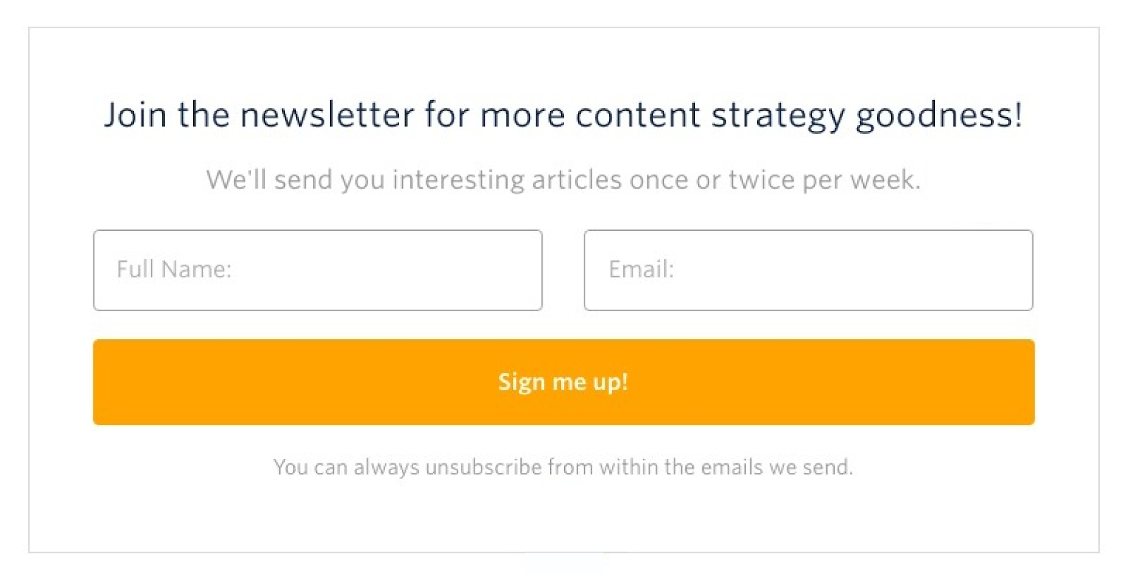
Similarly, this newsletter sign-up has the call-to-action, “join the newsletter,” in big bold letters, making it front-loaded. And that makes sense, because I need to understand this is a newsletter I could sign up for to get content strategy “goodness” before I need to know their sending cadence.
Happy UX writing 🖖


