


It’s been said time and time again that people don’t read; they scan.
Well, I think that’s only true to a degree. I agree, people don’t always read. But when they do read, it’s because they’re convinced something is interesting, relevant, or helpful to them.
So, basically, to get people to read, we as UX writers need to make it clear in a glance that an experience is of value, and they should take action.
How do ya do that? Clear UX writing is the answer.
Clear UX content means the words in your experience are:
- Easy to understand
- Easy to scan
- Obvious
- Unambiguous
- Leave no doubt
- Can’t be misinterpreted
- Don’t have technical terms
- Put the action up front and in context
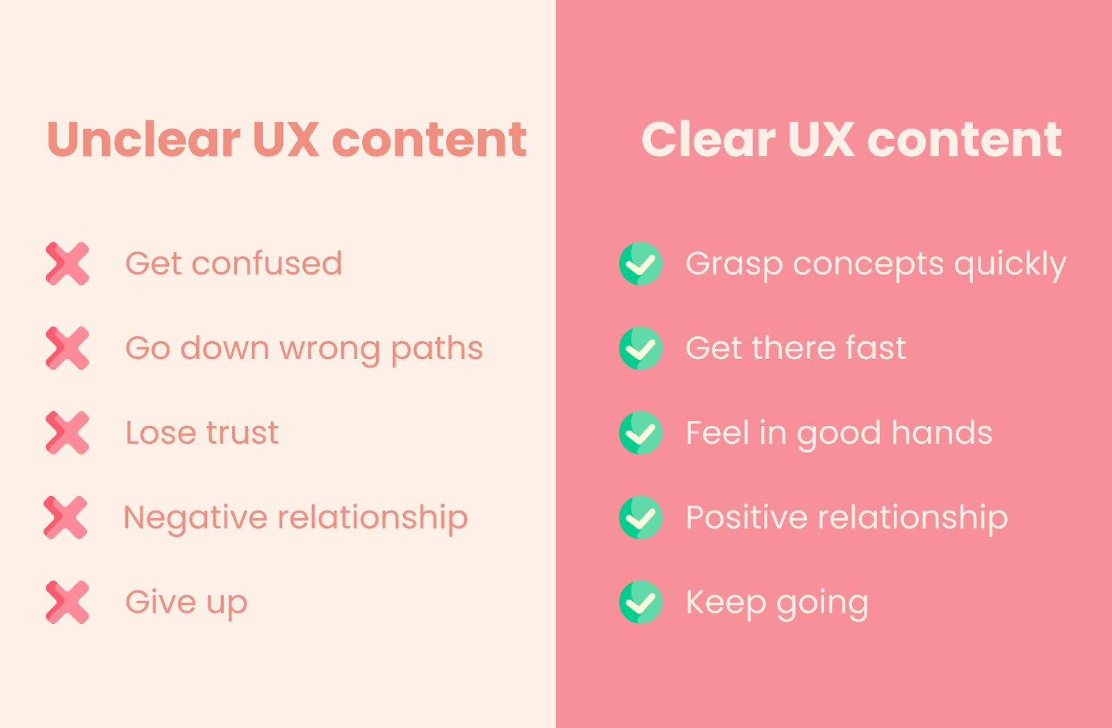
Clear UX content helps people:
- Grasp concepts quickly and easily
- Get to where they want to go with speed
- Feel like they’re in good hands
- Build a positive relationship with the product
- Keep going
When UX content isn’t clear, not only do people not read, they also:
- Get confused
- Go down the wrong path
- Lose trust
- Build a negative relationship with the product
- Give up
Yes, the wrong words are that powerful and can leave people feeling frustrated and alienated.
With clear UX writing in a product, people will stick around, engage with features, become valuable customers, and even evangelize the product.
For example, take this checkout button:

The button, or call-to-action, make it extremely clear that there’s no extra fees coming your way. It also reduces friction by outlining how you can access the E-Book, a real hesitation when it comes to hitting the “checkout” button.
Another example of clear UX content is this tool-tip from Google:

The tooltip clearly states that your mic is off, and you can click the mic to turn it on. There are no loopholes or lingering questions here.
So, how do you create clear UX content? There are 3 things to avoid that make your product unclear:
- Jargon
- Slang and cultural references
- Complex and complicated concepts
1. Jargon
Jargon is specific lingo only known by an exclusive group of people. It’s highly specific to those people and their specialty.
Think doctors, lawyers, and real estate agents. They all have their own language, which is made up of jargon.
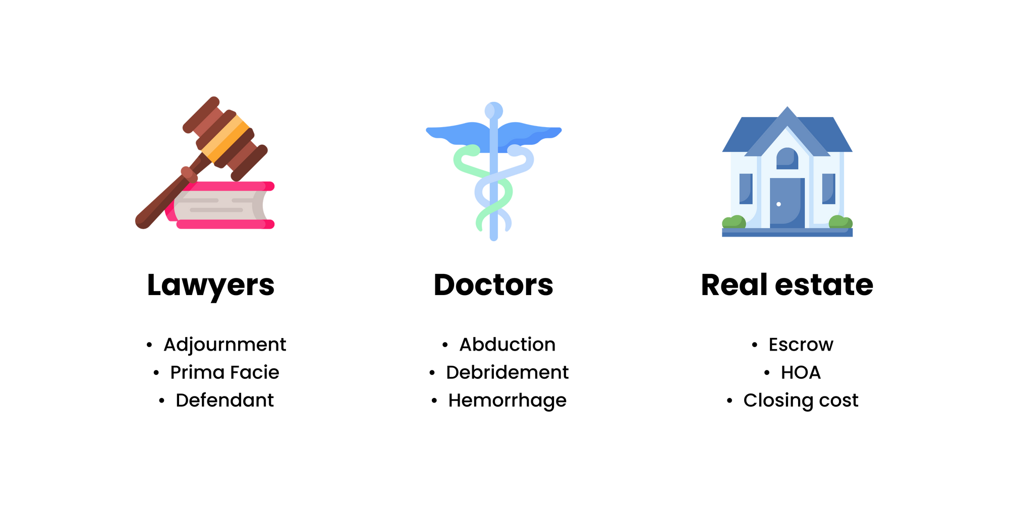
For example, a lawyer might say “adjournment,” and unless you watch a lot of Law & Order (hopefully SVU,) that’s gonna go over your head.
Same with a real estate agent talking about “escrow” when you’ve never closed on a house before — it’s going to be confusing and make you feel alienated and, well, dumb.
If you’re writing for a group like lawyers, doctors, or real estate agents, using jargon can build trust and credibility because you’re speaking their everyday language.
Tech is a bubble, and not everyone who uses our product understands our tech-y terms. People who use your product will find jargon hard to understand, and it can make them churn.
Instead of using jargon, you want to write in plain language.
According to PlainLanguage.gov, “Plain language is communication your audience can understand the first time they read or hear it.”
And it turns out plain language is preferred by everyone, even the most educated people.
To write in plain language:
- Know your user’s reading level, concepts and vocabulary familiar to them, and the questions they want answered
- If you don’t know your user’s reading level, aim for 6–8th grade reading level
- Pick words familiar to your users
- Write short sentences and paragraphs
- Follow formatting rules for readability (more on this later)
For example, take this microcopy from the insurance company, Lemonade:

Lemonade uses words like “stuff” to use words familiar to their users. Their sentences are short, and the reading level is approachable. You can read it quickly and grasp what Lemonade is trying to tell you.
Another example of plain language in action is Netflix’s “create account” screen:
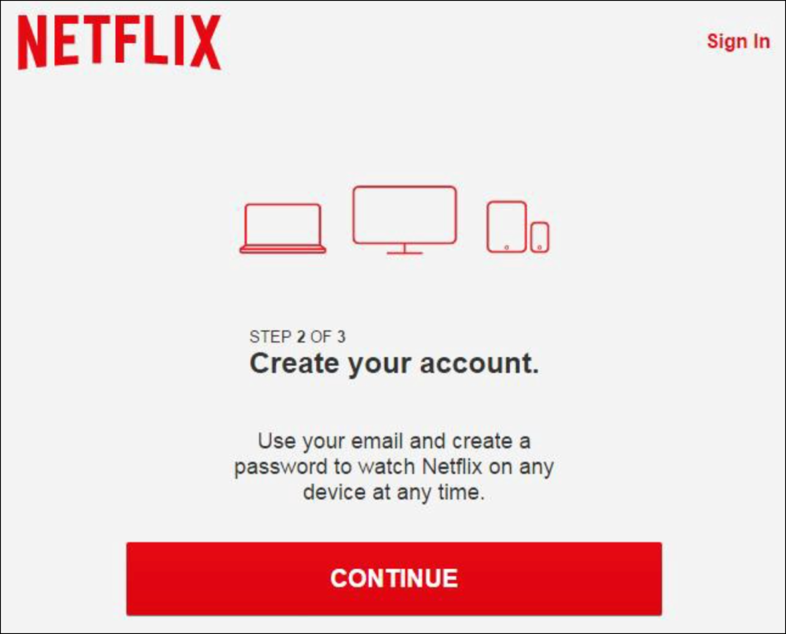
Netflix has a broad audience, and with a 5th grade reading level, almost everyone can read or hear this and understand it the first time around.
To find the reading level of your UX content, use Hemingway. It’s a free text editor that tells you your reading level in big, bold letters.
2. Slang and cultural references
Slang and cultural references are generational talk and references to pop culture.
Like jargon, using slang and cultural references can be alienating.
That’s because you can’t assume the knowledge and interests of the entire population of your product. That makes it best to avoid slang and references and opt for simple, clear microcopy.
For example, take these examples of slang and cultural references:

Do you understand any of the slang? I have heard of “stan,” and I only know “find your lobster” (Friends) and “I am Beyoncé always” (The Office) because I’m a 90s/00s child.
The plain language alternative can be understood by anyone and everyone, which makes them a better choice for UX content.
While the slang or cultural reference can seem like more fun, we’re not on the marketing team. Our objective is to make clear, useful, and usable experiences, which can be fun, but this isn’t the best way to make it fun.
Take this example of where InVision failed when using a cultural reference:

If you don’t know “Hold me closer, Tiny Dancer” is a line from a hit Elton John song, InVision’s button might have you scratching your head.
3. Complex and complicated concepts
Complex and complicated concepts are ideas native to the business that are hard for most people to wrap their head around.
Whether you’re writing for a data analytics company or working through a complex error message, complex and complicated concepts are everywhere.
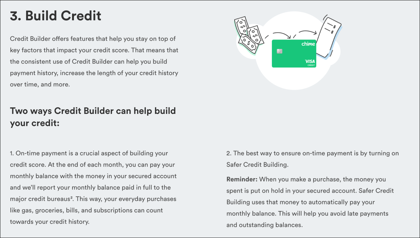
Take Chime’s Credit Builder card, for example.
It’s a card that helps you build your credit score. It’s not really a credit card, and you have to actually fund it. The inner workings of the card are quite complicated — just give their website copy a read:
The thing is, if a concept is hard for you to understand, it’s also hard for your end-user to understand.
That’s why we need to deeply understand complex concepts, so we have such a strong understanding that we can put into our own words.
We can’t rewrite a line about a complex concept, we need to translate it.
That’s easier said than done, but the first step is asking questions. Meet with the product manager and engineer, and deeply understand the inner workings of the product. Then, go meet with legal, and learn about how it’s regulated.
When you have gathered a thorough understanding of how the product works, write an explanation of it in your own words. Again, you need to understand it yourself before you can translate the meaning to someone else.
Once you understand a complex concept, make sure you don’t include more than one crystallized idea in a sentence or paragraph. Break them down and break them up.
To recap, to understand complex concepts:
- Ask a ton of questions
- Write an explanation to yourself first
- Don’t include more than one crystallized idea in a sentence or paragraph
- Break ideas down and break them up
As an example of what to do, take a look at this tool tip from Airtable:

If you’ve ever tried to use a database tool like Airtable, you know they’re complex and hard to figure out, especially as a first-time user.
By explaining how the product works one step at a time, Airtable deconstructed a complicated concept quite intelligently.
Happy UX writing 🖖


