


Bad UX writing isn’t as mystical as you might think, and you probably know it when you see it. For example, take this sign:
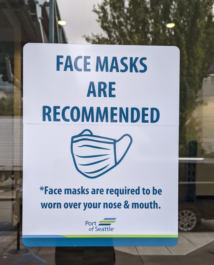
It’s confusing, right? How can face masks be “recommended” and “required”? Or this:
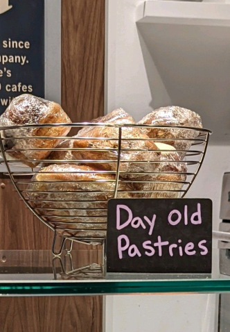
Are you (or is anyone) interested in “day old” pastries? No way — we want the fresh stuff.
You have the intuition for what makes “bad” UX writing, you just have to be able to distill it, so you can avoid it when designing experiences.
To understand what makes “bad” UX writing, we pretty much just need to flip what makes for “good” UX writing. Revolutionary, I know 🙃
So, following that model, there are 6 key attributes that make for “bad” UX writing:
- Unclear
- Lengthy
- Inconvenient
- Unhelpful
- Unusable
- Inaccessible
Let’s break that down…
1. Unclear
Unclear microcopy has jargon and leaves someone wondering. It’s:
- Hard to understand
- Hard to scan
- Not obvious
- Ambiguous
- Leaves doubt
- Is easily misinterpreted
Here’s an example of unclear UX writing from MySubaru:

For context, MySubaru is an app for Subaru owners to monitor the health and status of their Subaru.
This super-scary prompt just to tell us that our windshield wiper fluid is low. The level of escalation this prompt presents doesn’t match the degree of the problem.
When it comes to the content, this prompt could be much more clear if, instead of saying “health report issue,” it said “low windshield wiper fluid.”
Also, it would be more helpful to give guidance on how to solve the problem instead of saying “your attention is required.’”
And finally, the CTAs “Vehicle health report” and “Important info” aren’t distinct and different enough to give a good glimpse as to what’s on the other side, making them quite unclear.
2. Lengthy
Lengthy microcopy is long and not streamlined. It:
- Uses filler words and phrases
- Has no logic as to the order of information presented
- Uses passive voice
- Uses hyperbole
- Uses the longest form of a word
Here’s an example of some lengthy UX writing:
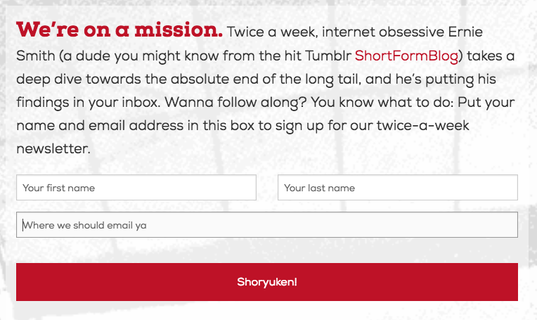
This email opt-in prompt is quite long just to say sign up for our twice-a-week newsletter. It uses filler words and phrases, like “absolute,” and instead of saying “bi-weekly,” uses the much longer version, “twice-a-week.” The sentences also run on, making it hard to follow.
3. Inconvenient
Inconvenient microcopy offers no or little guidance. It:
- Doesn’t offer context to help people make decisions
- Doesn’t write a path for every direction
- Ignores people in all their possible states
Take this upsell from iTrackBites:
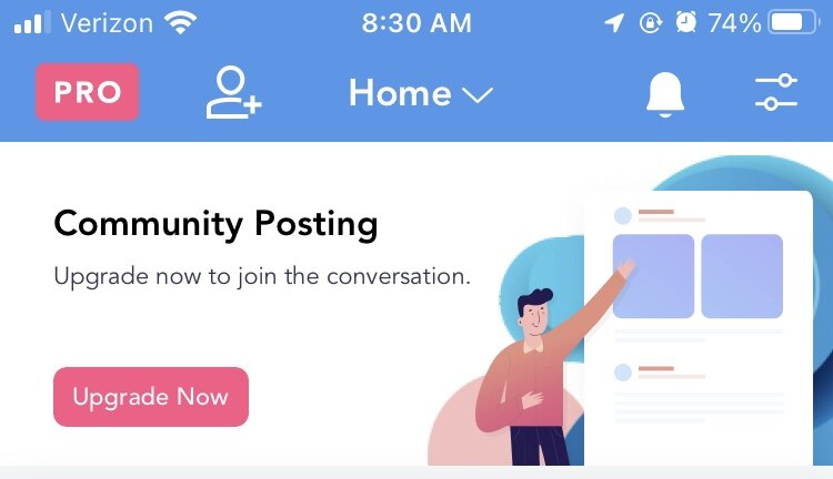
iTrackBites is a food-logging app that helps people lose weight.
In this prompt on the app’s “Community tab,” iTrackBites upsells their Premium offering in context. The problem is it’s not exactly clear what the upgraded feature is.
One can gather that if you upgrade now, you’ll be able to make posts in the community. But what do I get out of that? Advice from like-minded people? Tips and tricks from people going through the same process? Is it like Instagram or more like TikTok? How much does it cost?
With those questions lingering, it makes it hard for someone to make a decision and understand if Premium is a good option for them. Also, there’s no way to dismiss this upsell, which means it fails to write a path for every direction.
4. Unhelpful
Unhelpful microcopy makes experiences with a lot of hassle. It:
- Leaves people with unanswered questions
- Surfaces information without being aware of the user journey
- Doesn’t uncover what context is *actually* helpful
- States facts without translating the value for someone
For example, take this pop-up from Reddit:

While it’s all cute and fun, it leaves you wondering what the value is of using the app instead of the browser. Instead of convincing me the app is a better experience, the pop-up gets in the way and makes me feel bad about being a “dog person.”
The prompt would be more helpful if the header stated the value of using the app, like, “Browse without ads.” (Totally making that up, FYI)
While that’s less fun, UX writing isn’t always about being fun — clarity needs to come before delight.
5. Unusable
Unusable microcopy makes it hard for people to engage. It:
- Makes someone think about how a product works
- Has distractions throughout an experience
- Makes completing tasks hard and complicate
- Has a high cognitive load
Take this retro error message from Microsoft:
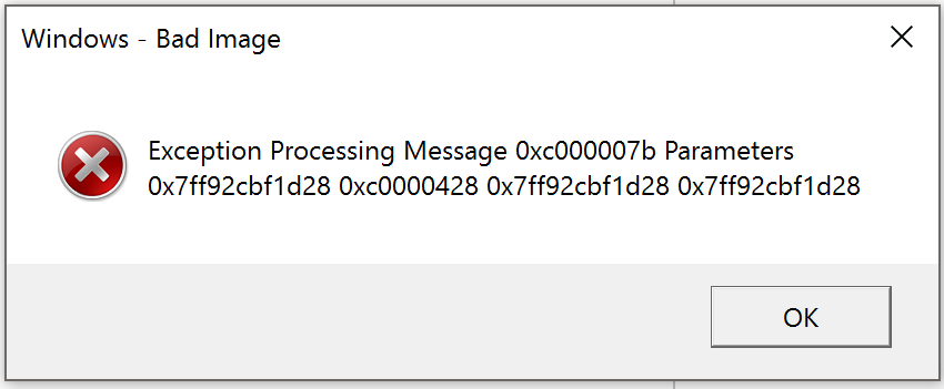
Unless you’re a Microsoft engineer, and even then, there’s a good chance you have no idea what this error message is telling you. Because you can’t comprehend it, it has a high cognitive load, making the task hard and complicated to complete.
6. Inaccessible
Inaccessible microcopy excludes people. It:
- Uses words like “click” and “view,” assuming how someone is navigating a product
- Uses images with words on them, not text
- Orders UI elements, so the action comes before information and instruction
- Relies on visuals to convey information
- Writes un-descriptive, confusing calls-to-action
Take this before and after text:
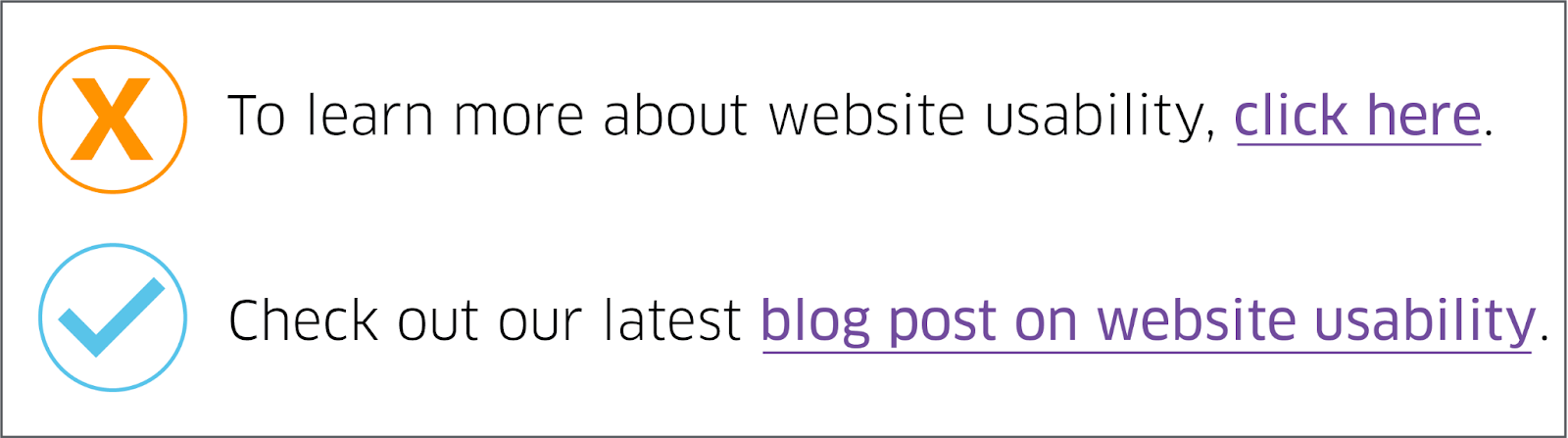
In the before version, the “click here” doesn’t explain what the link is or does, and it forces users to read around the link to figure out where it will lead them. “Click here” is also ambiguous on its own.
A link’s text should explain what users are clicking, give them an idea of where it will take them, and help them understand the context of the link. In the after version, we resolve that by using short, descriptive words to clearly explain what the link is and where it will lead users.
Examples of “bad” UX writing
Let’s tie it all together and walk through some “bad” examples of UX writing:
Twitter: “Lists” empty state

The problem here: What’s a “List”? Especially because Twitter is using List with a capital “L,” they’re making it a “thing.” But if I’m a new user, I have no idea what a list is. Is a List where I save tweets I like? Do I collect accounts I like in a “List”? Or is it some sort of to-do “List”? I dunno.
So, by saying you need to “create a List before adding someone,” Twitter is putting the cart before the horse, meaning they’re explaining the desired action before the value it adds to someone’s Twitter experience.
A more clear message might be:
Header: Your Lists are empty
Body: Lists create a separate feed with specific accounts you add.
CTA: Create List
GoodRx: Enable notifications prompt
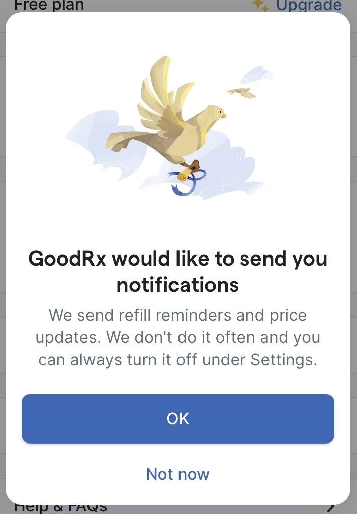
GoodRx helps people find deals on prescriptions. I found this prompt by browsing the app, and it could be improved in a few ways.
First, the header — the (arguably) most important piece of microcopy on the screen — offers no value, doesn’t state the benefit, and is written from the viewpoint of the company, not the consumer.
If GoodRx took their first line of body copy and put it in the header, they’d solve all of that. For example:
Header: Never forget a refill
CTA: Turn on reminders
Most of the time people read the header and CTA and call it a day. That’s why it’s so important to make sure the most important value is communicated upfront.
One thing GoodRx does well is sharing this setting isn’t permanent, and if you change your mind, simply go to Settings to turn it off.
Flo app: Analysis question

Flo is an app that helps women track their period and ovulation cycles. This screen was shown as one question in a flow to assess one’s current cycle performance.
This screen struggles because it’s not being specific enough to help someone make a decision. What’s being analyzed? My health? Am I going to get feedback or suggestions, or data I need to interpret? What value do I gain from having one of these analyzed? Will my data be shared?
Many unanswered questions are left hanging, and there’s no context as to what each option entails. Will I be shown a graph? What’ll be shared that I don’t already see in the app today?
Also, the “Report for a Doctor” CTA seems misplaced on this screen and confuses the desired action one should take.
LinkedIn: “Focused Inbox early” access
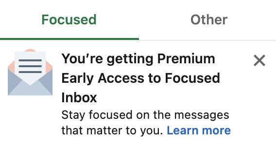
Jargon, jargon, jargon. LinkedIn has branded two terms in one sentence: “Premium Early Access” and “Focused Inbox.” That leads to jargon overload.
When you brand too many terms, your experience becomes unclear, because you’re basically speaking in company language, a language your user doesn’t speak.
Also, LinkedIn has the opportunity to lead with the benefit, “Stay focused on the messages that matter to you,” in the headline.
For example:
Eyebrow: NEW
Header: Stay focused on important messages
Body: As a Premium benefit, you’re getting early access to Focused Inbox. Learn about Focused Inbox
I added an eyebrow, because as UX writers, we design with words. That means it’s as much about adding content in as it is taking it away.
Impersonal email sign-up
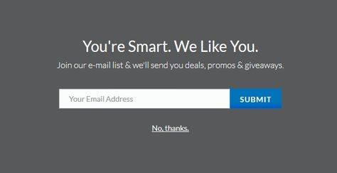
This email sign-up is incredibly impersonal. You don’t know me. How can you like me if you don’t even know my name yet?
This is a bad example of UX writing because it’s inauthentic and unhelpful. It doesn’t explain the benefit of joining the newsletter other than some mysterious “deals, promos & giveaways” that we don’t even know are relevant to us.
Also, if you read the headline and the opt-out only, you’d be responding to their “compliment” with “No, thanks.” Which is just silly.
Happy UX writing 🖖


