


Ever explored a digital product and felt like you could use a helpful hint? That's where tooltips come in.
Tooltips are user-triggered messages that provide extra info about a page, element, or feature. Tooltips look like this:

Tooltips have short, helpful microcopy that add color to whatever they’re pointed at.
When it comes to tooltips, the onion approach, or progressive disclosure, is key. Tooltips aren’t necessary, and the experience should still be clear without them. They’re like the second or third layer of the onion — there for extra help if or when you need it.
There are 3 primary ways products use tooltips:
- To explain
- To give a tour
- To announce
1. To explain
Tooltips can make the world a more clear place.
They can be used to crystallize user goals, get rid of concerns, or explain why something matters. Basically, if you don’t know what something is or why it matters, a tooltip could be a helpful tactic to resolve those concerns.
Here’s an example of how Canva explains the + button with this tooltip:

By adding a tooltip to the plus button, the user gets context as to what the button does, allowing them to use it with confidence.
2. To give a tour
Many companies use tooltips in the onboarding process as an interactive way to teach the user how to use the product. It’s a great strategy because it doesn’t overwhelm the user with TMI, reducing their cognitive load.
Here’s an example of how Slack uses tooltips to give a new user a tour of their product:

Through bite-sized bits of knowledge, Slack shows a new user in context how to use the product, which is much more powerful than describing it out of context.
3. To announce
If a product needs to announce something, like a new feature, or an existing feature change, a tooltip can be a great way to inform the user about this without interrupting their workflow.
Here’s an example of how Google Analytics introduces Audiences:
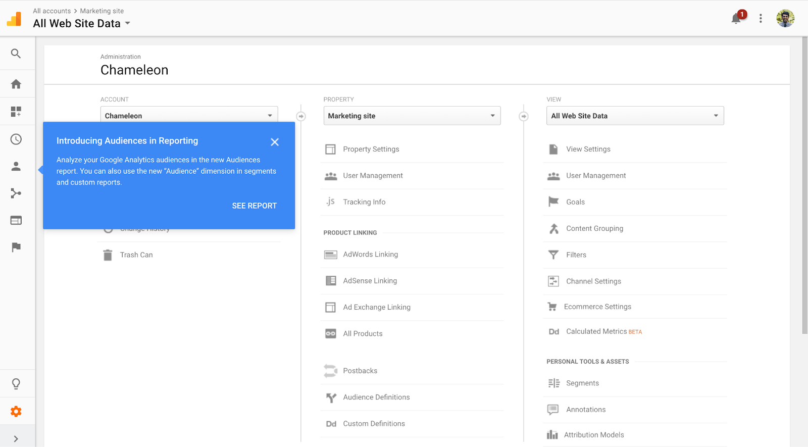
It’s a light way to tell you there’s a new feature and give you a quick tip on how to use it.
Why do tooltips matter?
Let’s take a trip back in time — you’re in 9th grade, and you’re being forced to run “the mile” (I say forced because running goes against every fiber in my body.)
You’re huffing and puffing, and you don’t think you can make it. You have a quarter of a mile left, and you’re thinking about walking the rest of the way because you just can’t do it.
Then, your fellow gym mate yells behind you, “You can do it! Only a quarter mile left. That’s two more minutes if you keep running. You got this!”
With that extra push, you power through the fatigue, and finish “the mile” strong.
Tooltips are like that totally make believe gym mate (kids typically aren’t that nice) — they give users that extra push in the right direction and help them succeed.
Instead of helping you finish “the mile,” tooltips help you understand and orient yourself in a digital environment quickly, so you can keep making progress toward your goal.
Without tooltips, users might figure things out, but it’ll be a more confusing, frustrating, and guess-based experience.
If we can help users out, why wouldn't we?
What makes tooltips effective?
Effective tooltips:
- Are always necessary
- Use progressive disclosure
- Are concise
- Are benefit-oriented
Effective tooltips are always necessary
Tooltips are interesting, and a bit different from every other component we’ve talked about so far, because they’re optional. A user experience can exist without a tooltip and make perfect sense.
That’s why it’s on us to make sure the tooltip is *absolutely* necessary and not just added arbitrarily.
A good rule of thumb is to do a gut-check to see if the tooltip adds value. And if you have nothing to say that adds value to the user, don’t use a tooltip.
For example, here’s a tooltip from Wix that’s not necessary and doesn’t add value:
It doesn’t add any new relevant or interesting information, and redundantly repeats the label.
Now, here’s that same tooltip from Wix, but written in a way that makes it valuable and necessary:

With this revised tooltip, it provides critical information that informs what language you pick.
Effective tooltips use progressive disclosure
Tooltips are a perfect example of the lower layers of an onion. It’s lower priority, but it can still help users get to where they’re going.
For example, here are the “layers” you peel:
- Layer 1 – Main screen: Display the critical info on the screen
- Layer 2 – Tooltip: Add brief, extra guidance
Now, we’re going to get very meta, because while tooltips are a form of progressive disclosure, effective tooltips also utilize progressive disclosure within them.
And that’s layer 3:
- Layer 1 – Main screen: Display the critical info on the screen
- Layer 2 – Tooltip: Add brief, extra guidance
- Layer 3 – Link: Link to in-depth explanation
You can only say so much in a tiny tooltip. By linking out to a help article or blog post with more context, you let the users who need more context happily explore, while not overwhelming the users who get it with just the info in the tooltip.
Here’s an example from Google Drive:

By giving the user the option to “learn more” about this feature, you let users learn to their own, specific desire.
Effective tooltips are concise
Tooltips aren’t a time to tell a long-winded story, they’re a time to get to the point.
Because the space is tiny, and the impact should be big, every word in an effective tooltip needs to pack a punch.
Here’s an example from Tumblr on what not to do:

This is saying too much and not adding enough relevant information. It’s a classic case of TMI, where it’s giving the user all the info, while they only need a subset of it to make the decision.
To make the tooltip more punchy and concise, we can take out 90% of the copy:

By being concise, we can direct users on what to focus on and help reduce cognitive load.
Effective tooltips are benefit-oriented
Not all features will, but if a feature has an important or interesting benefit, include it in your tooltip. This will give users a reason to care and a reason to act.
For example, here’s a tooltip from LinkedIn that doesn’t give you a reason to care:

It doesn’t tell you why you should care about a “reaction”. It assumes you’ll want to do more than “like,” and it doesn’t hit on a user's pain point.
Now, here’s that same tooltip with the benefit included:

With the benefit of “reacting more dynamically” explained, the user is more likely to take LinkedIn up on that advice.
Good examples of tooltips
Random email sign-up

This tooltip does an excellent job explaining in clear terms why they’re asking for your email address. And their reason is pretty good. You’re gonna want that confirmation number, and it’s logical they’d need your email address to send it to you. It makes sense that this info is a tooltip, because not every user is going to question why this product is asking for their email address.
IBM

IBM’s tooltip provides necessary context while being very clear about what the benefit is to the user (ensuring no downtime.) They do this succinctly, and they don’t leave any lingering questions.
Adobe
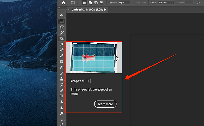
Adobe’s tooltip does a great job utilizing progressive disclosure. It tells you what the crop tool is very succinctly, and if you need more explanation, you can “learn more.” Adobe could go one step further and explain the benefit of the crop tool to make it A+.
Bad examples of tooltips
Humanity
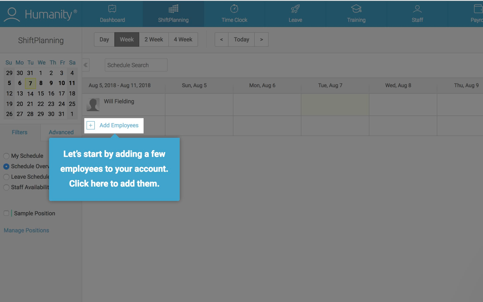
This tooltip from Humanity is poorly written because it’s putting too much in the tooltip. The tooltip is a tip, not a full on action step. By including the instruction (add a few employees) and the action (click here,) Humanity has misinterpreted what tooltip onboarding means. Instead of adding context as to how to use features, it instructs them to use the features without helpful context.
Random pricing plan
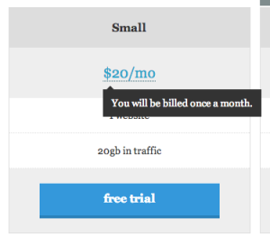
This tooltip is in the bad examples list because it’s completely unnecessary and useless. It just repeats what’s in the copy. “$20/mo” clearly translates to being billed once a month. This tooltip should be deleted — it’s confusing and clogging up the user experience.
Pendo
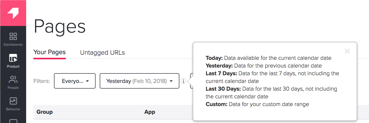
This tooltip from Pendo is unsuccessful because it’s broad, not specific. Instead of showing a tooltip for each specific option, it shows all the options in one mega tooltip. This creates information overload and a really high cognitive load, which makes the tooltip lose its value.
Happy UX writing 🖖


