


A headline is the biggest, baddest piece of microcopy on a screen.
It’s usually at the top, and it’s typically the first thing that catches your eye.
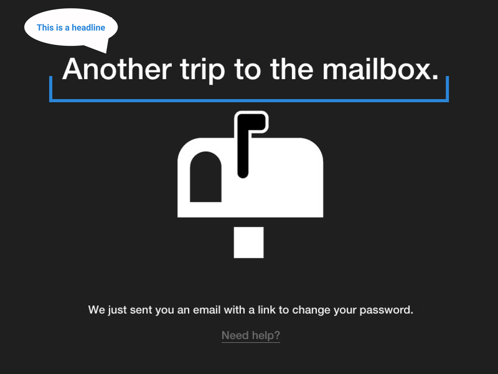
Since a headline is displayed so up front, it plays an important role in communicating the most important message.
Why do headlines matter?
Because headlines are so big and bad, it’s likely one of the first pieces of content a user will ingest on a screen. That’s important because it sets the tone for what they understand the screen is about.
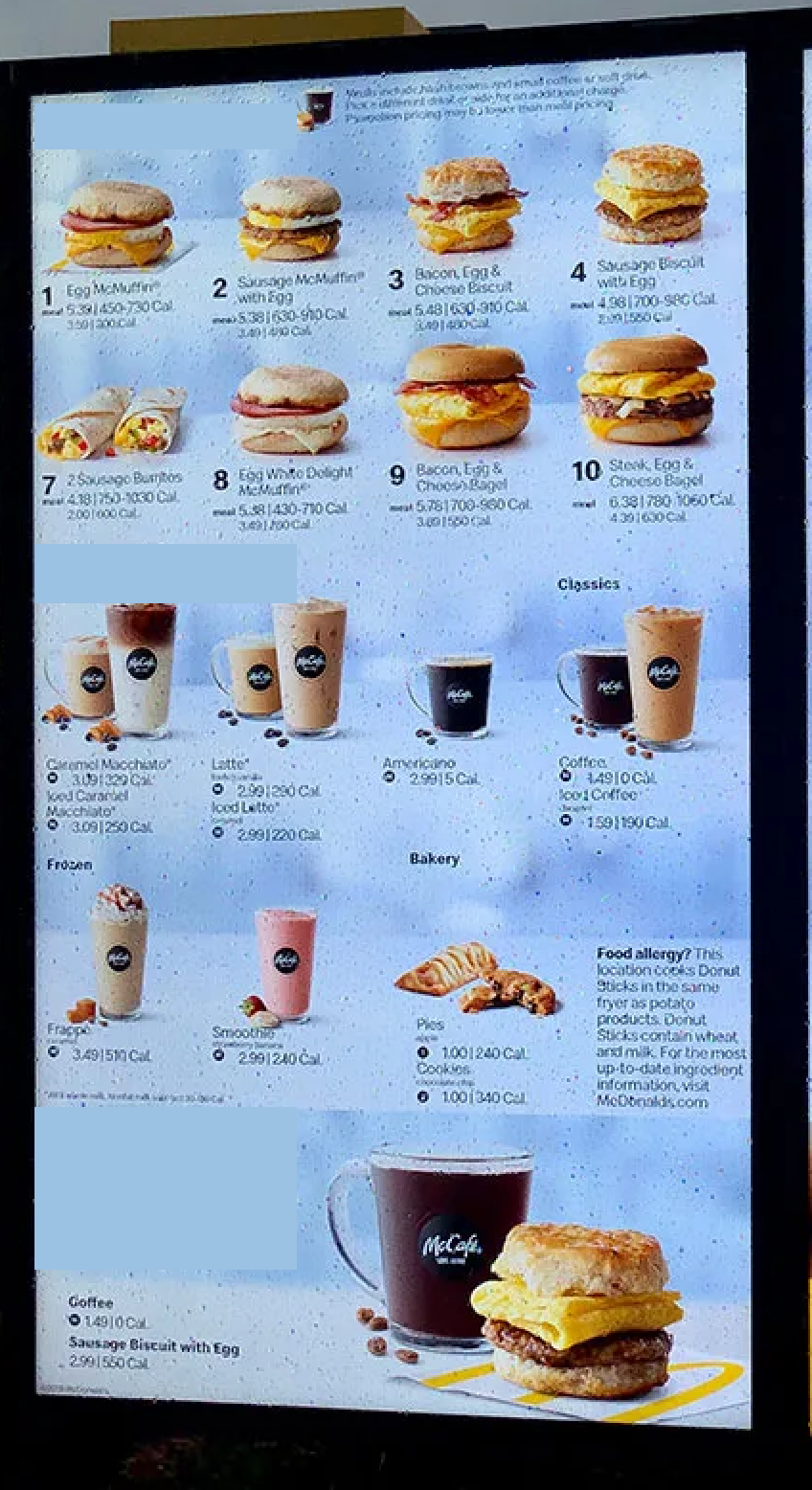
For example, take the McDonald’s menu:

The headlines make it easy for you to scan and mentally organize how the menu is arranged, so you can quickly make a decision.
Now, imagine the McDonald’s menu had no headlines:
You have to take more time to read each product description because you can’t rely on any headlines to categorize what you’re looking at.
Similarly, take a look at Google’s create account screen:
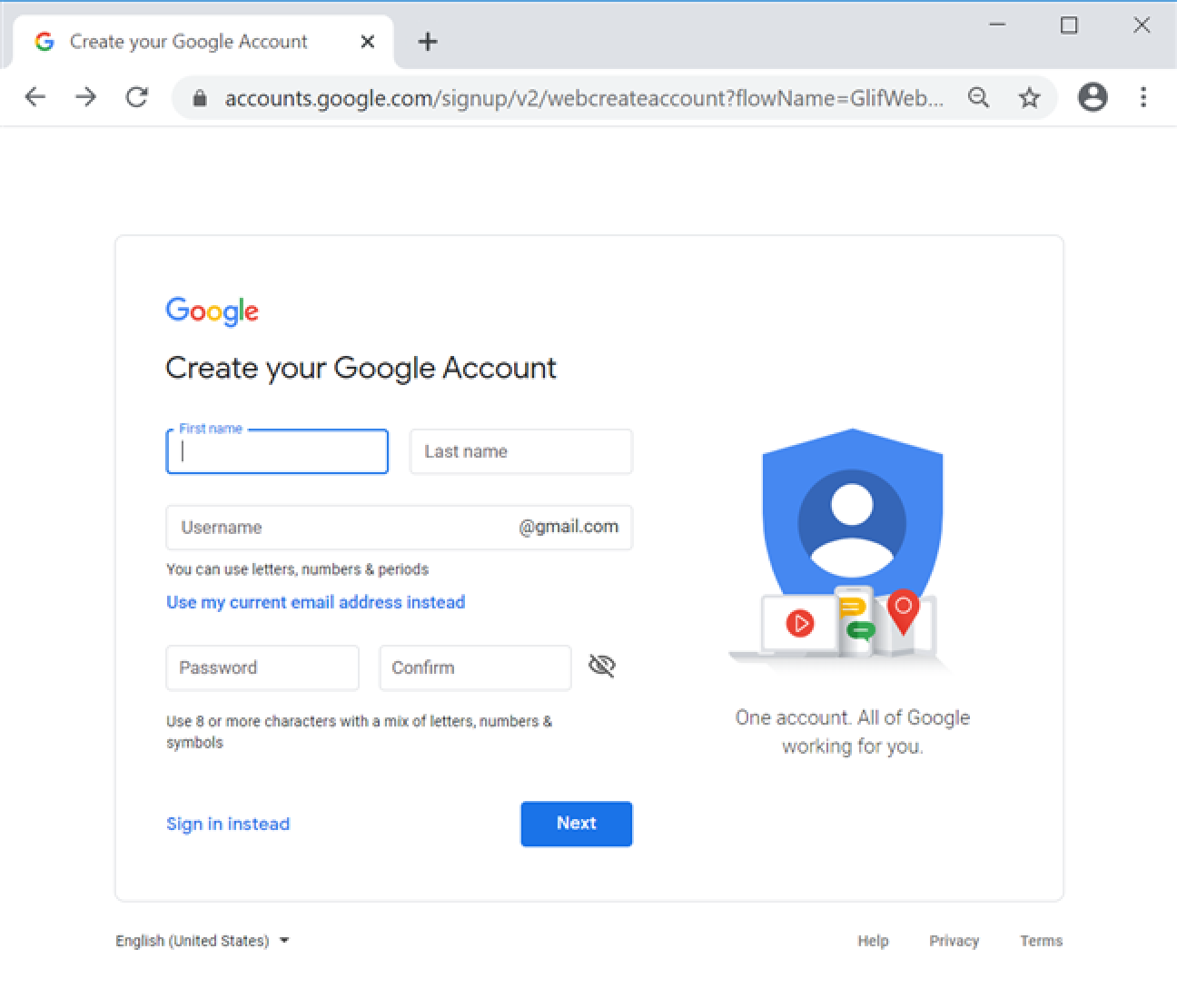
The headline “Create your Google Account” succinctly summarizes what you’re doing on this screen and what the goal is.
Now, compare that to a headline-less account creation screen:
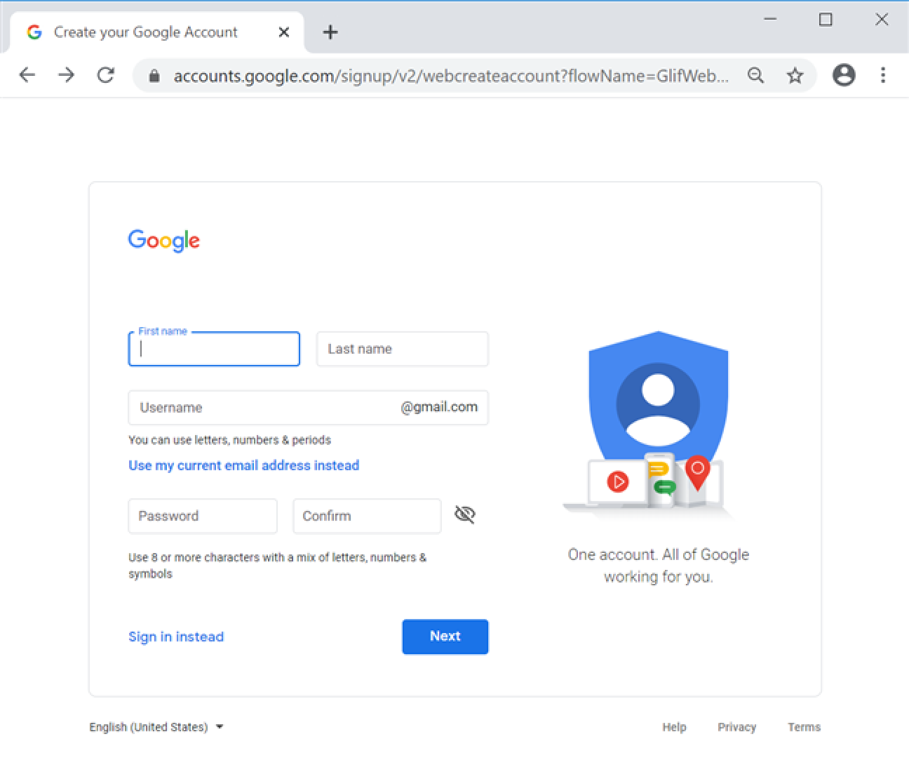
Seems kinda sketchy, right? You’re not sure why Google is asking you for all this info or what the point is, which leaves you hesitating with unanswered questions.
How to write effective headlines
Effective headlines:
- Are concise
- Communicate the desired action
- Communicate the value delivered by completing the desired action
- Summarize the main point of the screen
That’s a mouthful, so let’s break each one of these down:
Effective headlines are concise
Concise means a headline is compactly written, so every word serves a heavy-lifting purpose.
It’s important to be concise, or brief, because, if your microcopy is too wordy or long, the connection becomes slow, awkward, and ineffective. Essentially, being concise speeds up understanding a lot.
For example, here’s a headline that’s not concise:
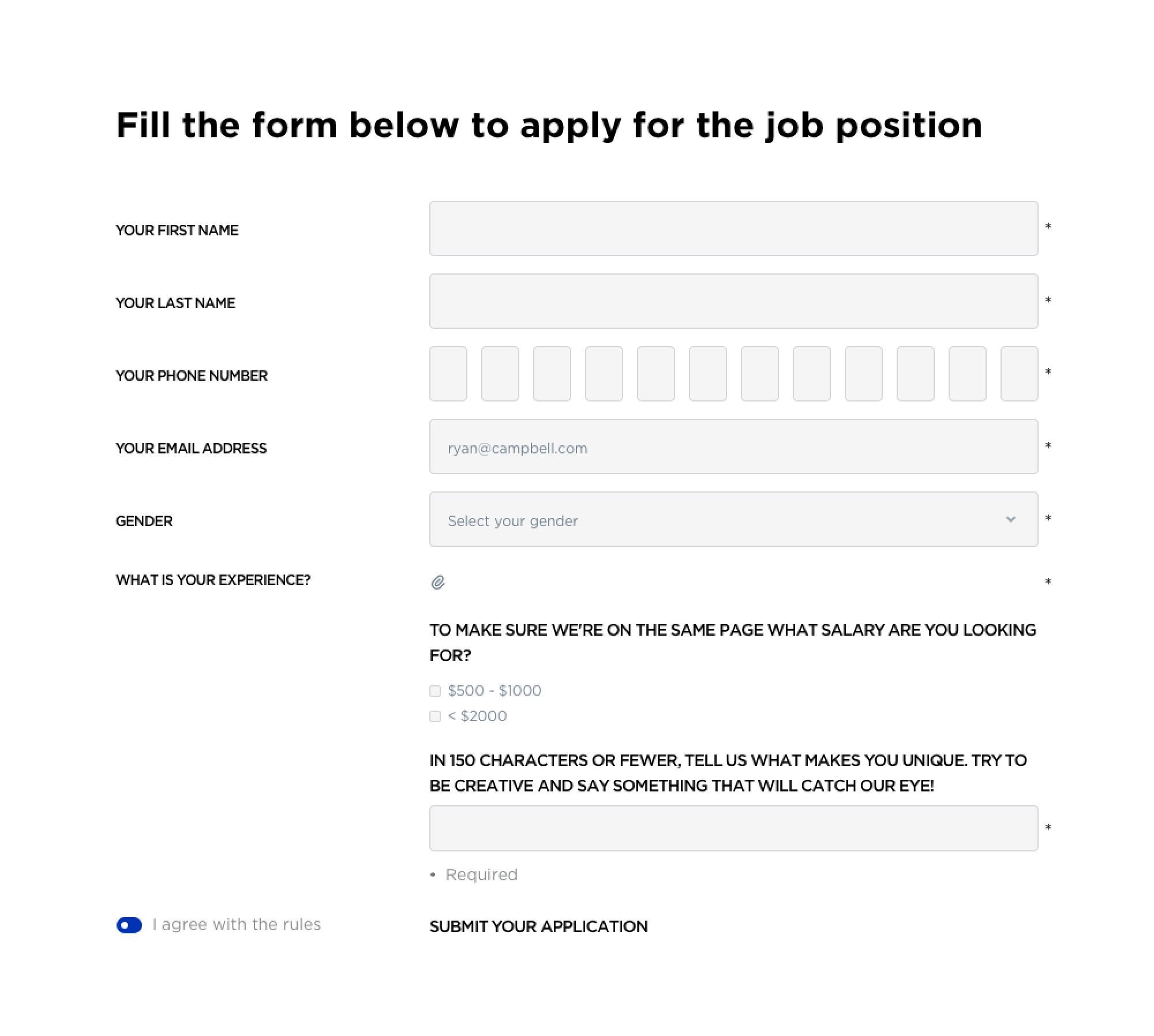
It’s already implied the form is below, and “job” and “position” are redundant.
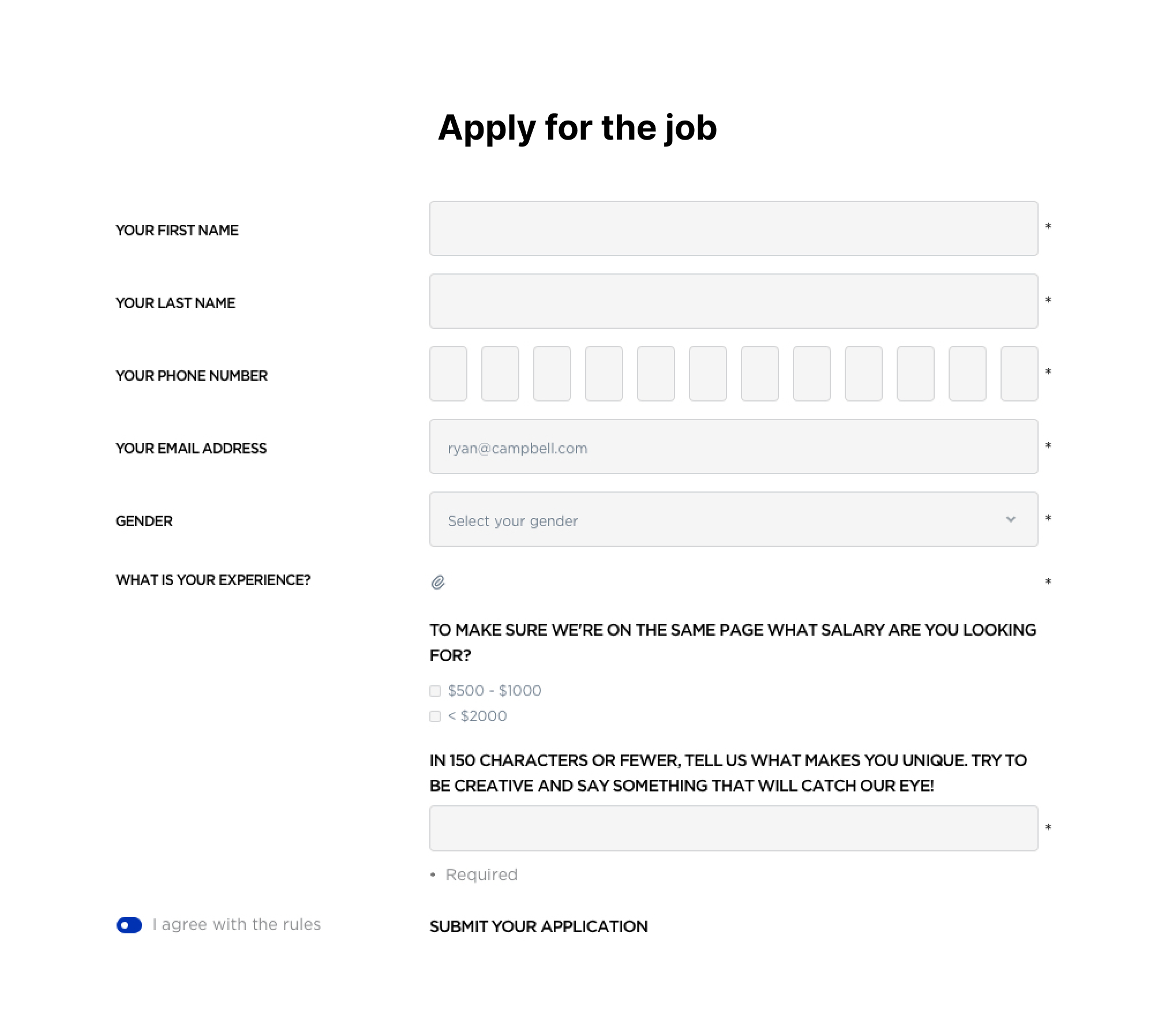
To optimize for conciseness, we can edit the headline to something like this:
Conciseness alone doesn’t form an effective headline, which brings me to our other points…
Effective headlines communicate the desired action
This means effective headlines point the user toward accomplishing a goal.
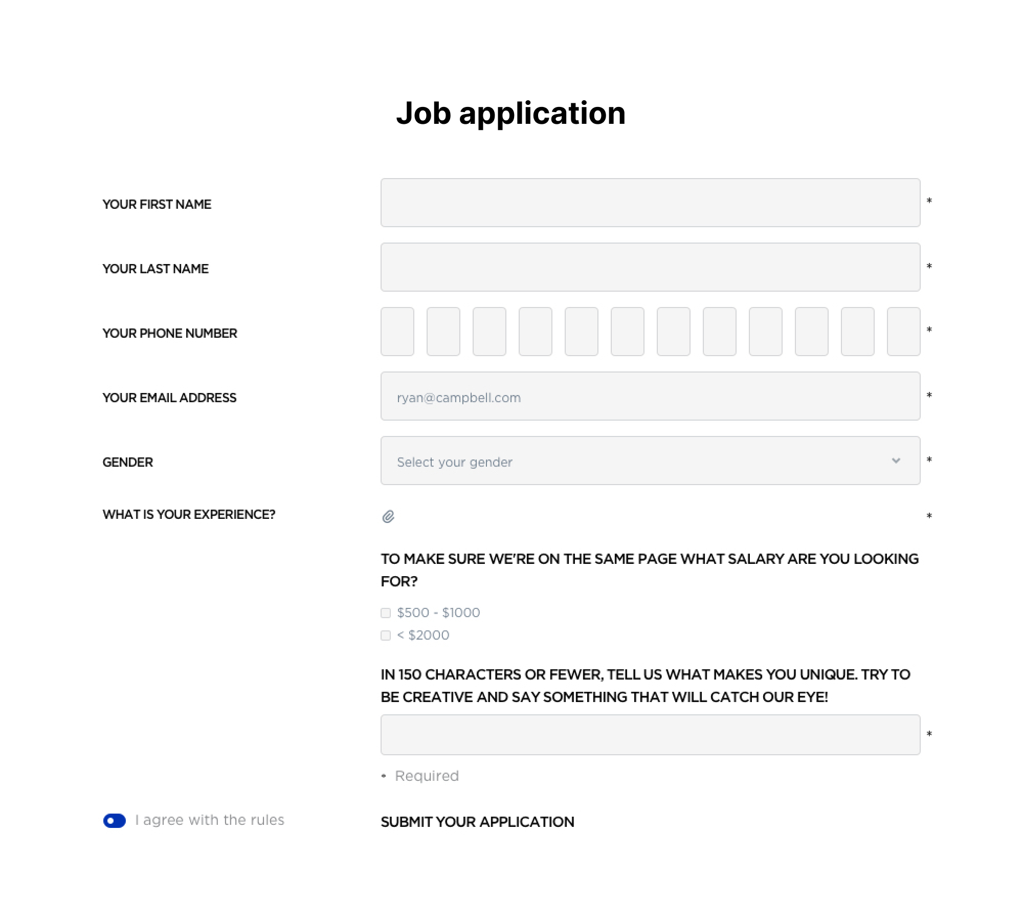
For example, the headline “Job application” doesn’t communicate what action you should do, but just describes what the screen is:
Our concise example also fulfills our goals of communicating the desired action by instructing someone to “apply for the job,” the desired action:
Effective headlines communicate the value delivered
Our “Apply for the job” headline example isn’t really incentivizing. That’s where this tactic comes in — when you communicate the value a user gets by taking action, you give users a reason to act.
Compare that to this headline:
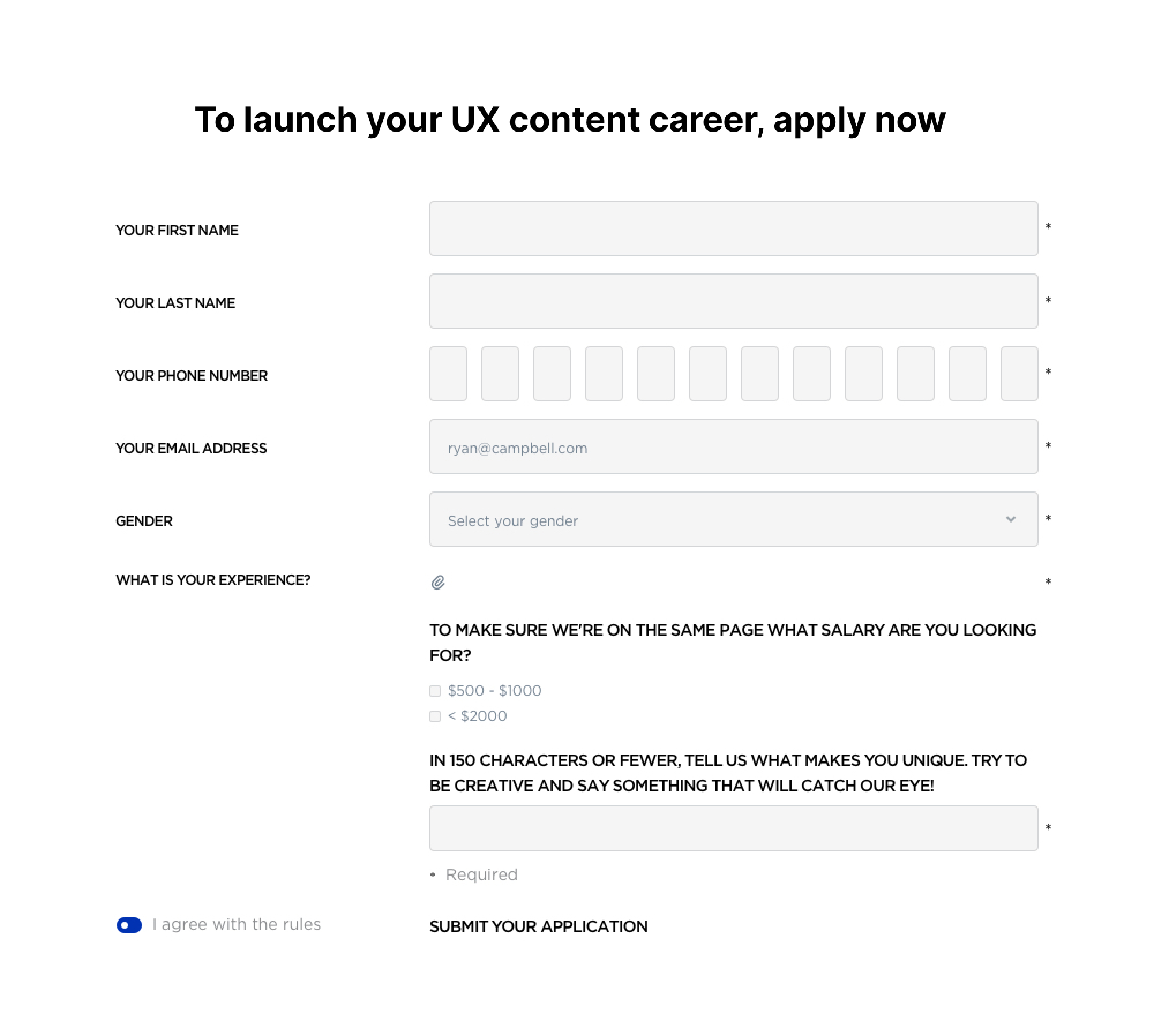
With this edit, it becomes clear the value you get from applying is launching your UX content career, which is a pretty cool thing 😎
Effective headlines summarize the main point
While our last example does an OK job at summarizing the main point of the screen, we can do better.
For context, summarizing the main point of the screen is pretty much what it sounds like — getting the point across quickly about what the screen’s goal is.
Take this next iteration:
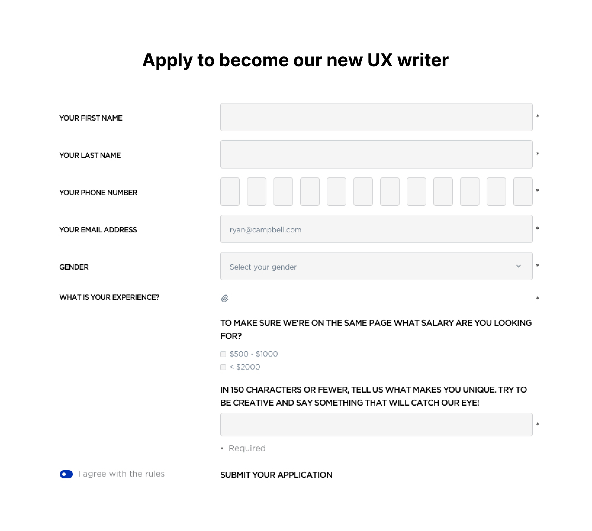
With this iteration, it becomes the most crystal clear that the point of this screen is for you to apply to become the company’s new UX writer.
Now, each of those criteria isn’t created equally.
For example, it’s more important to summarize the main point of the screen than be brief. That’s because, while being brief might make for a neater screen, it’s more important to communicate what’s going on.
When writing an effective headline, prioritize the criteria in this order:
- Summarize the main point of the screen
- Communicate the desired action
- Communicate the value delivered by completing the desired action
- Be concise
Now, let’s walk through how these criteria play out when creating an effective headline with a real example.
1. Summarize the main point of the screen
People only read what's relevant and valuable to them.
They’re scanning to understand if the screen is worth their time. Therefore, it’s important to succinctly summarize what this screen is all about, so someone can make an informed decision.
Take this headline in a prompt from Tower that wants someone to enter their email to download the Performance Toolkit:

This is a good example of a headline that summarizes the main point of the screen well.
The headline here clearly states the purpose of the prompt: “Getting your Performance Toolkit.” There’s nothing left in question.
You also don’t have to read the full sentence to grasp the point. You can take a glance and easily digest the message.
This is just the first step to building an effective headline, though.
2. Communicate the desired action
At a bare minimum, an effective headline summarizes the main point of a screen. The next level is incorporating the desired action into the headline.
Continuing with the Tower example, by changing “get” to “download,” we’re more explicit about the action someone needs to take, therefore creating a crisper, more accurate message.

This sets expectations and adds transparency about the process involved.
Also, note how we changed “the Performance Toolkit” to “your Performance Toolkit.” This one-word change adds a layer of possession over the action, which can help incentivize people.
3. Communicate the value delivered by completing the desired action
Put yourself in the shoes of someone viewing this modal. Does it seem a little commanding?
It’s saying you should download this Performance Toolkit, but if you’re like me, you haven’t taken a moment to read the body copy to understand why you would want to download the toolkit.
Communicating the “why” is imperative to conversion. Because you can’t assume someone currently cares or will take the time to figure out why they should care.
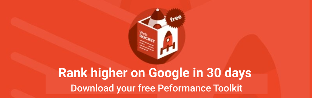
Take this next iteration:

The first thing someone reads is the value they get from the toolkit: Increasing their Google ranking in 30 days. That’s a huge benefit that was mentioned nowhere beforehand.
With this iteration, it’s immediately clear in a glance why someone should care about this toolkit and if it’s relevant to them.
4. Be concise
While the previous iteration gets the message across in the headline, it’s a tad long.
While effectively communicating the message should always come before being as concise as possible, we can design with words and explore other elements to trim the content down to make it even more scannable.
Now, take this last iteration:
In this last iteration, we added a sub-headline to communicate the message more concisely.
We’re learning how to design with words, not fill in the blanks. If you need another element to best communicate your message, feel empowered to explore and get creative.
Sub-headlines are a great way to support your headline with more context in a high-priority way. You don’t always need one, but it can be a great way to use less body copy and increase scannability.
Another way we made this headline more concise was by getting creative with the words we used. By using “rank” as a verb instead of a noun, we can use “higher” as an adverb, trimming the number of words needed to communicate the message.
Good headline examples
Now, let’s take a look at some additional headline examples that hit these best practices.
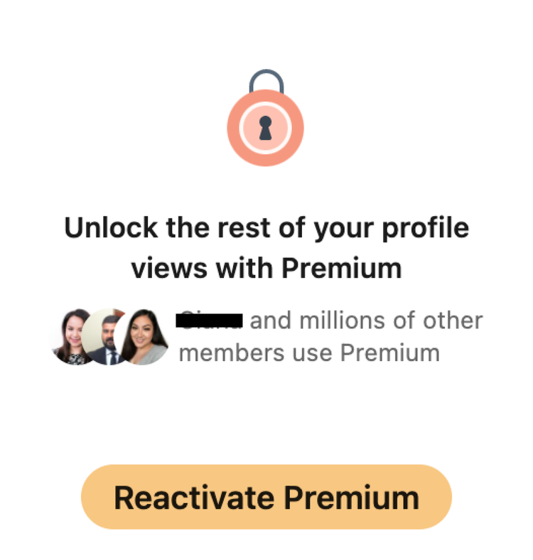
LinkedIn’s headline is effective because it expertly links something you might want (unlock the rest of your profile view) with upgrading in one succinct line of microcopy. The headline creates an air of FOMO without making someone feel bad or guilty.
Rover
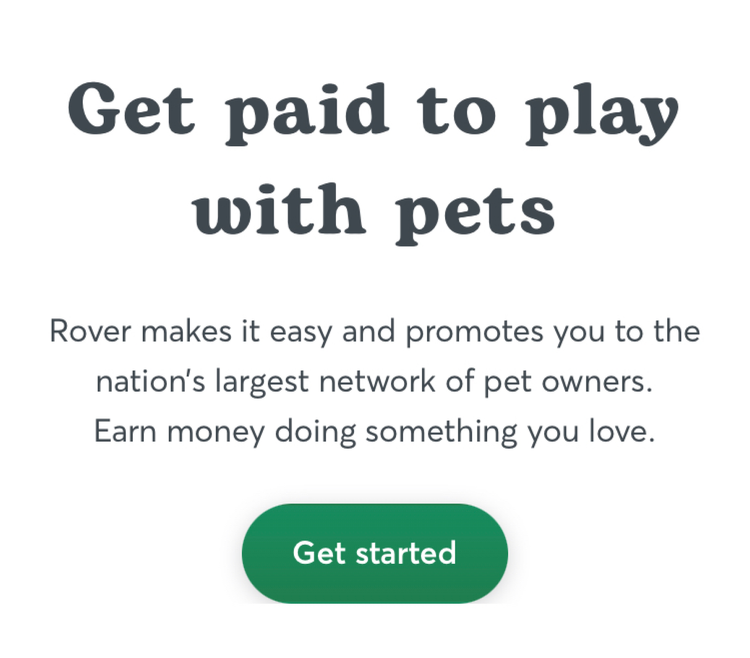
Not all headlines need to be fancy or snappy. Rover’s headline is effective because it cuts directly to the value offered by working with them: Getting paid to do something you enjoy.
LastPass
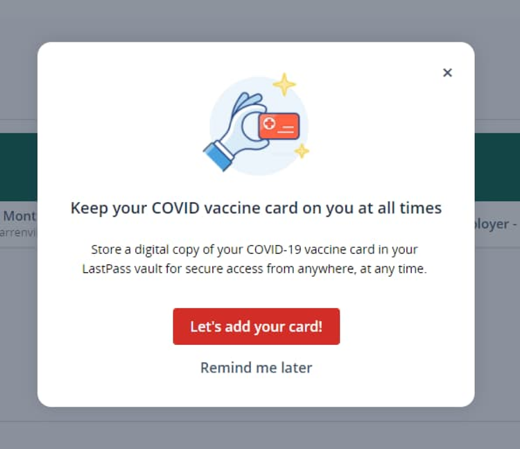
Similarly, LastPass designed an effective headline that showcases the value their product can offer by hitting on a pain point for most people: Carrying their COVID vaccination card. LastPass alludes to the fact that their product is the solution.
Bad headline examples
Because we can learn just as much from what not to do, let’s look at some examples of headlines that don’t follow best practices and can be improved:
Ionic
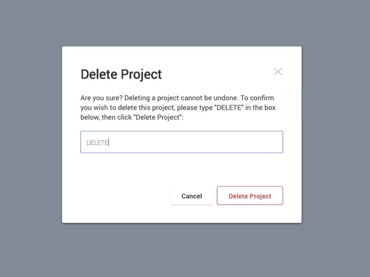
Ionic wastes space in their headline here because their headline just repeats the button, or call-to-action. What would someone lose from deleting their account? Is it permanent? There’s a version of this headline that’s more clear about the action and outcomes.
For example, something like “To permanently delete your project, type ‘DELETE’” offers more context as to what’s happening, what someone would need to do, and what the implications are.
Deputy
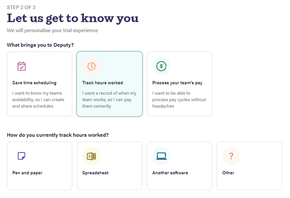
“Let us get to know you” is company-centric, not user-centric. Deputy’s phrasing puts the company’s needs before the person’s, which is a no-no. Also, the real value, that they’re personalizing your trial experience, is deprioritized, even though that’s the main benefit to someone going through this flow. Combining the sub-headline and headline into a line like “Let’s personalize your trial experience” would more effectively get the job done.
Drops

The point of this screen is to prime someone that they’re about to learn how Drops works. “Hi” adds no value in communicating that message. Instead, Drops could talk about how quick or easy the next few minutes will be. Or, Drops could frame it as the first step to learning their desired language. Make use of every line of microcopy, or take it away — UX writing is as much about adding words in as it is taking them away.
Happy UX writing 🖖


