


Usable UX content is the baseline for solid engagement. It’s what makes people sign up, do everything you want them to, and continue to stick around.
You know UX content is usable when it:
- Doesn’t make someone think about how a product works
- Offers no distractions throughout an experience
- Makes completing tasks is easy and intuitive
- Has a low cognitive load
An experience isn’t usable if someone…
- Has a lot of questions about how a product works
- Gets frustrated throughout the experience
- Resorts to Googling how to accomplish a goal
So, how do you make UX content usable? Nielsen Norman Group (a big-deal design-thinking studio) has the answer.
According to Nielsen Norman Group, there are 10 (very famous) usability heuristics:
- Visibility of system status
- Match between system and the real world
- User control and freedom
- Consistency and standards
- Error prevention
- Recognition rather than recall
- Flexibility and efficiency of use
- Aesthetic and minimalist design
- Help users recognize, diagnose, and recover from errors
- Help and documentation
Heuristic:
Mental shortcuts that allow people to solve problems and make judgments quickly and efficiently. Kinda like cheat-sheets.
Let’s dive into each of them…
Heuristic 1: Visibility of system status
Visibility of systems status sounds super technical. To be honest, all the Nielsen Norman Group heuristics sound technical. But fear not — Ima break ‘em down.
Visibility of systems status means your design should always keep users informed about what’s going on through appropriate feedback within a reasonable amount of time.
All that means is giving users insight and visibility into where they are in their journey.
Have you ever looked at a “You are here” map in a mall?

The “You are here” marker fulfills the visibility of systems status, because it pinpoints where you are in the world, and lets you decide where you want to go next.
Same with this progress bar from Lego:
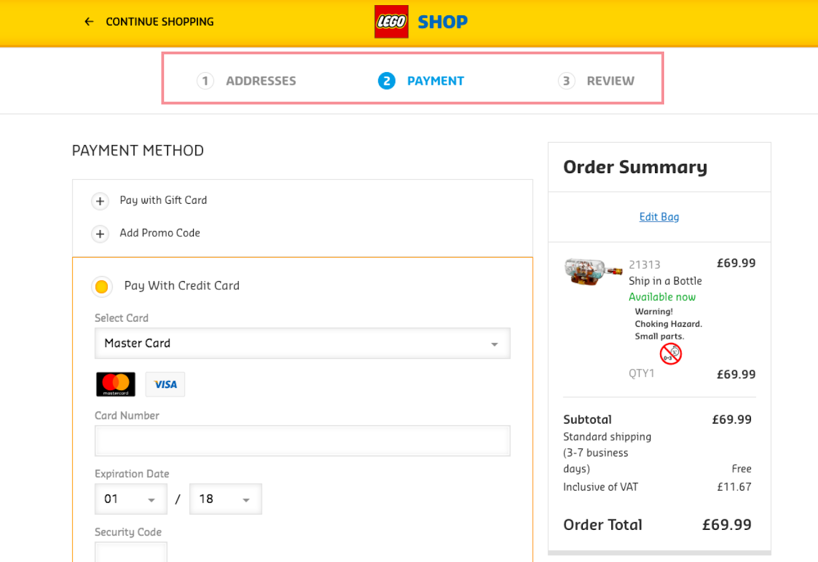
The bar at the top orients you within the checkout process, so you can feel peace of mind and a sense of control.
To create UX content with visibility of system status:
- Make sure a user knows where they are within the product, and don’t mislead a user to go a direction they didn’t choose, especially without telling them
- Present feedback to the user as quickly as possible (ideally, immediately)
- Keep open and continuous communication throughout the product. You can’t really over communicate, and this will build trust.
Heuristic 2: Match between system and the real world
Match between system and the real world means the design should speak the user’s language and follow real-world conventions.
Use words, phrases, and concepts familiar to the user, rather than internal jargon or concepts you’re making up because they seem creative.
The idea here is the most usable UX content isn’t fully original, but it mimics everything else.
You might be thinking that sounds crazy — how do you make an impact, otherwise?
Unlike copywriting, UX writing isn’t about being interesting. We do our jobs well if our content is so usable and easily understood, it fades into the background.
To get to that level, the UX content you create can’t be novel — it needs to make social and society patterns and norms, so users don’t have to spend too much time thinking.
For example, have you ever used a stove top where the controls didn’t match the layout of the burners?

That goes against the match between system and the real world, which is why it trips you up and you most likely turn the wrong burner on.
But when the stove top controls match the layout of burners, you can quickly understand which control maps to each burner. And that’s because there’s a match between system (stove top controllers) and the real world (burners.)
Similarly, would it trip you up if someone asked you, “Where did you park your automobile?”
It might not confuse you, but it would take you aback, because in today’s world, “car” is the status quo.
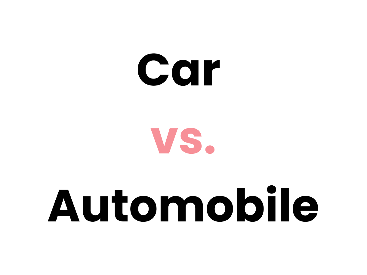
When someone doesn’t use familiar and societally-normal language, it gives you pause. Versus if the person has just said, “Where’s your car?,” you would say, “Over there,” without thinking twice.
To create UX content with a match between system and the real world:
- Use everyday language. If someone needs to pop out a dictionary, you’ve failed.
- Make sure you and your users use words the same way and understand concepts to be the same. If you’re coming from different walks of life, make sure you understand your users before you start designing.
- Participate in user research whenever you can. It’ll help you uncover what words are normal for your users, as well as their mental models around important concepts.
Heuristic 3: User control and freedom
User control and freedom means not trapping users if they make a mistake.
Users often tap things and take a wrong turn. That’s why you need to give them a clearly marked “emergency exit” to get outta there without having to go through a big ‘ol hassle.
A great example of this is the undo button:
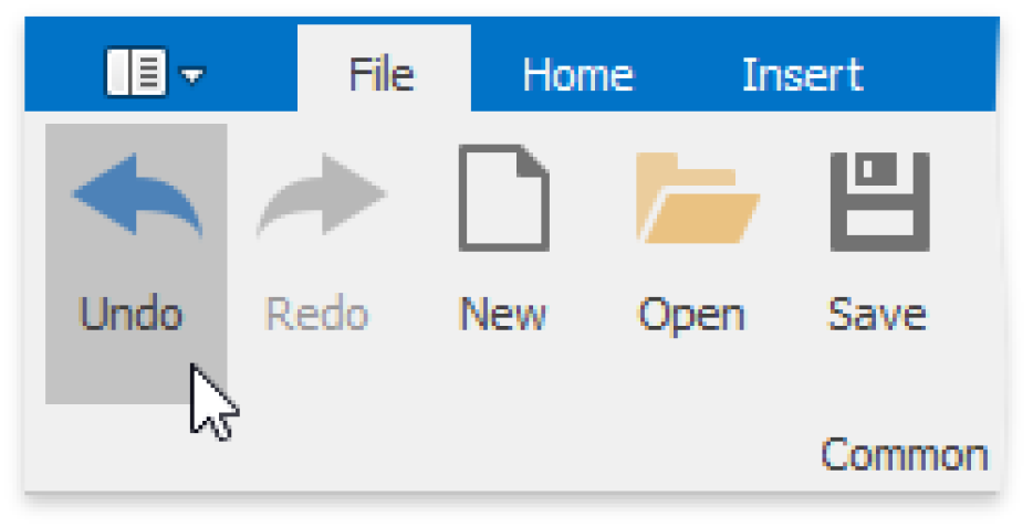
By letting someone “undo” something, you give them freedom, because they don’t have to worry about their actions — everything is easily reversible.
Similarly, is giving users a way out, like this example from Apple:
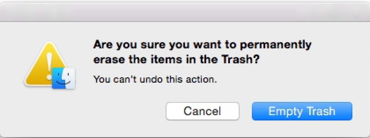
Users shouldn’t have to commit to a process once it’s started — they should be able to easily cancel and abandon.
To create UX content with user control and freedom:
- Support Undo and Redo
- Show a clear way to exit the current interaction, like a Cancel button
- Make sure the exit is clearly labeled and discoverable
Heuristic 4: Consistency and standards
Consistency and standards means users shouldn’t have to wonder whether different words, situations, or actions mean the same thing.
Instead, products should follow company and industry conventions.
As an IRL example, check-in counters are usually located at the front of hotels. This consistency meets customers’ expectations.

Another example is notification design:
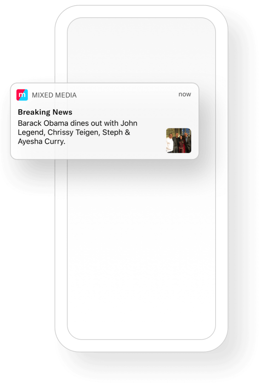
Standardized notification design provides a similar but distinguishable look and feel for different app pop-ups. This makes it easy for a user to realize “ah, this is a push notification,” and not be caught off guard.
A good example of maintaining consistency and standards in UX content is style guidelines and voice & tone guidelines.
Style guidelines outline rules around the styling of language, like grammar, mechanics, punctuation, and much more. You can see a good example of a style guide here from Inuit.
Voice and tone guidelines outline the product personality and how the product sounds, so multiple UX writers can create UX content, but it all sounds like it’s from the same voice. Check out Intuit’s voice & tone guide here.
To create UX content with consistency and standards:
- Improve learnability by maintaining consistency within company guidelines and the broader societal norms
- Maintain consistency within a single product or a family of products (company guidelines)
- Follow established industry conventions (broader societal norms)
Heuristic 5: Error prevention
The best designs carefully prevent problems from occurring in the first place. That’s why the fifth heuristic is error prevention.
To prevent errors, you can:
- Eliminate error-prone conditions
- Check for them, and confirm with users before they commit to an action
For example, have you ever driven on the Pacific Coast Highway in California? If you haven’t, it’s beautiful, but the fear of falling off the road is too real.

Thankfully, guard rails prevent anxious drivers from falling off of the cliffs. That’s a good example of eliminating error-prone conditions.
Likewise, this purchase confirmation from Delta gives users another chance to review the flight details:
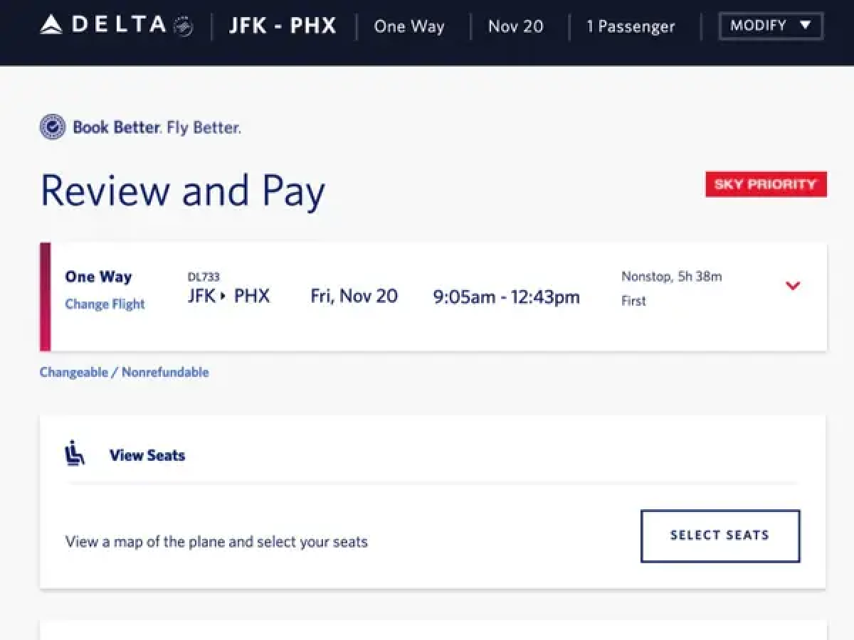
This is a good example of preventing errors by confirming with users before they commit to an action.
To create UX content with error prevention:
- Prioritize your effort: Prevent high-cost errors first, then little frustrations
- Avoid slips by providing helpful constraints and good defaults
- Prevent mistakes by forcing people to remember too much, supporting undo, and warning users before they do something questionable
Heuristic 6: Recognition rather than recall
Recognition rather than recall means minimizing the user's memory load by making elements, actions, and options visible.
The user shouldn’t have to remember information from one part of the product to another.
For example, there are two ways to ask about the capital of Arizona:
- Is Phoenix the capital of AZ?
- What’s the capital of Arizona?
The first option, “Is Phoenix the capital of Arizona,” helps someone answer more quickly because they don’t have to recall what the capital of Arizona is — they can just recognize that it’s Phoenix.
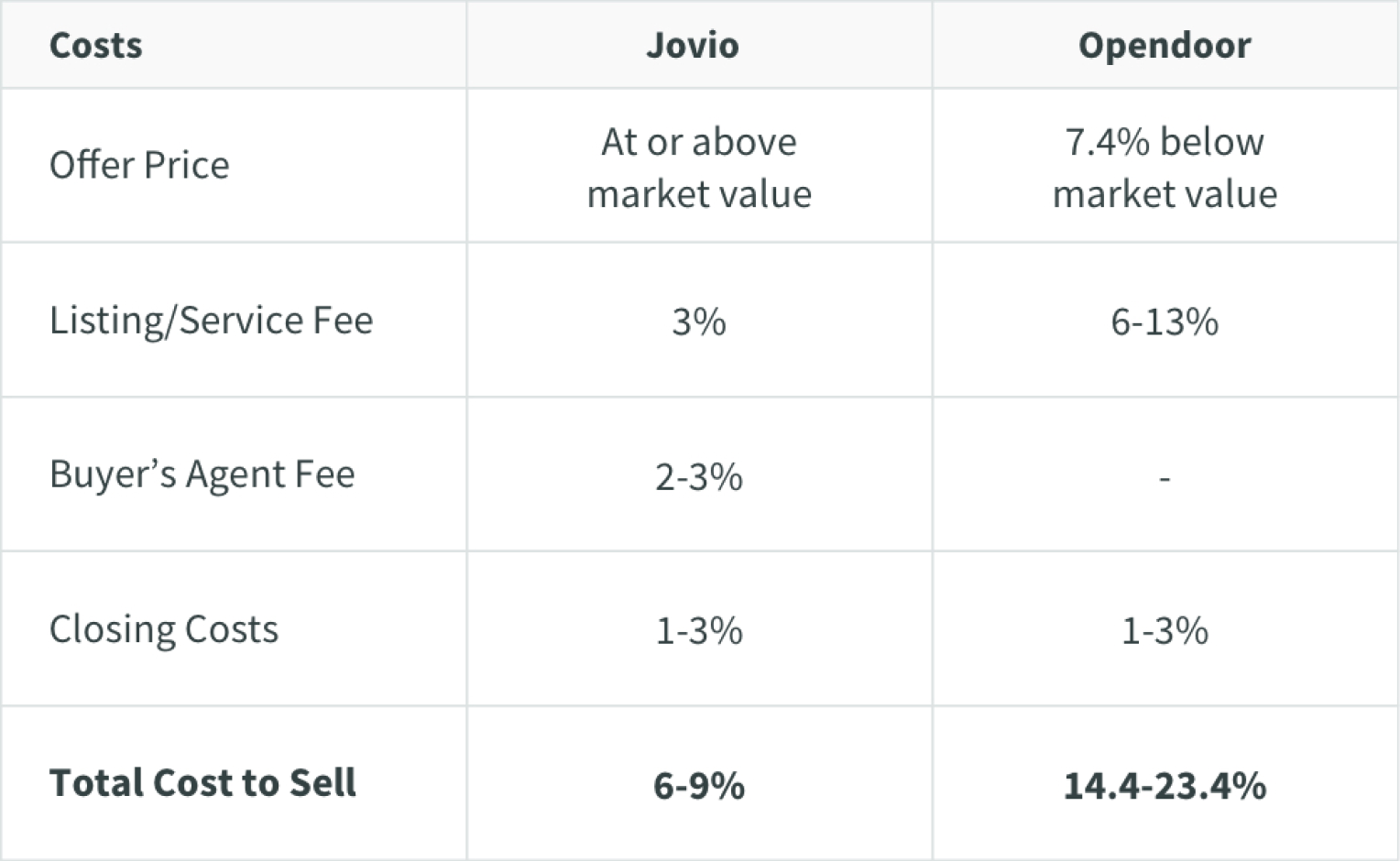
Similarly, this feature comparison chart from Opendoor lets you recognize what’s better instead of relying on you to recall it:
To create UX content with recognition rather than recall:
- Let people recognize information in the product, rather than having to remember (“recall”) it
- Offer help in context, instead of giving users a long tutorial to memorize
- Reduce the information that users have to remember
Heuristic 7: Flexibility and efficiency of use
Flexibility and efficiency of use means designing paths for power users and newbies alike.
If a user is already an expert, don’t make them go through the tutorial. Similarly, if the user is brand new to a product, don’t drop ‘em in and expect them to figure it out.
A prime example of this is your classic shortcut on a hiking trail:

Regular routes are listed on maps, but locals with more knowledge of the area can take shortcuts.
Similarly, keyboard shortcuts for complex products can help expert users finish their tasks more efficiently.
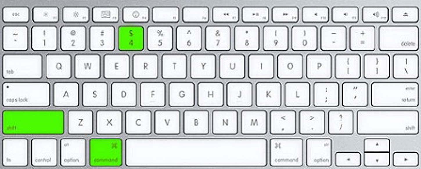
On the flip side, you can use a keyboard without shortcuts perfectly fine, making it accessible to new typers (or just not optimizers,) too.
To create UX content with flexibility and efficiency of use:
- Provide accelerators, like keyboard shortcuts and touch gestures
- Provide personalization by tailoring content and functionality for individual users
- Allow for customization, so users can make selections about how they want the product to work
Heuristic 8: Aesthetic and minimalist design
The idea behind aesthetic and minimalist design is that products shouldn’t include information that’s irrelevant or rarely needed.
Every extra piece of information in a product competes with the relevant info and makes the helpful stuff hard to find.
A good example of this is Fitzgerald vs. Hemingway:

Fitzgerald (left) was a beautiful, extravagant writer with a penchant for adjectives. Hemingway (right) on the other hand was so straight and concise, he once wrote a 6-word story.
Over-decoration can cause distraction and make it harder for people to get the core information they need. Meaning, good UX content = team Hemingway.
Similarly, messy UI makes it hard for users to find the content they’re looking for; Organized UI makes it easier.

To create UX content with aesthetic and minimalist design:
- Keep the content and visual design of UI focused on the essentials
- Don't let unnecessary elements distract users from the information they really need
- Prioritize the content and features to support primary goals (and know what the primary goals of a user journey are)
Heuristic 9: Help users recognize, diagnose, and recover from errors
Help users recognize, diagnose, and recover from errors is exactly what it sounds like — if a user takes a wrong turn, help them get back on track.
That means error messages should be expressed in plain language (no error codes,) precisely indicate the problem, and constructively suggest a solution.
An IRL example of this is a “wrong-way” sign:

Wrong-way signs on the road remind drivers that they are heading in the wrong direction and ask them to stop.
Here’s a good example of how to handle a product error:

Good internet connection error pages show what happened and constructively instruct users on how to fix the problem.
To create UX content that help users recognize, diagnose, and recover from errors:
- Use traditional error message visuals, like bold, red text
- Tell users what went wrong in language they will understand — avoid technical jargon
- Offer users a solution, like a shortcut that can solve the error immediately
Heuristic 10: Help and documentation
It’s best if a product doesn’t need any extra explanation. However, it might be necessary to offer content to help users understand how to accomplish their goals.
That’s where the help and documentation heuristic comes into play.
Help and documentation is what it sounds like — help content documented in a product.
An IRL example of this is the information desk at an airport:

Information kiosks at airports are easily recognizable and solve customers' problems in context and immediately.
In products, information icons reveal tooltips to explain jargon when users touch or hover over them, which offers contextual help:
To create UX content with help and documentation:
- Make sure help documentation is easy to find
- Whenever possible, present the help content in context the moment the user needs it
- List concrete steps to follow
Tips for writing usable UX content
Now that you know the 10 famous usability heuristics, here are some final tips to make sure you’re designing and writing usable UX content:
- Be clear before cute
- Collaborate closely with engineers to understand the technical nitty-gritty
- Break up large chunks of microcopy
- Only use words that serve a heavy-lifting purpose
At the end of the day, usability trumps delight.
Happy UX writing 🖖


